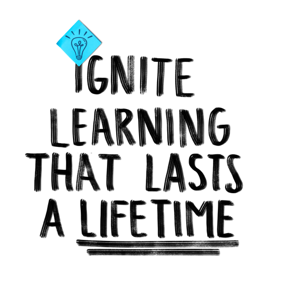
back to school campaign
The annual Back to School campaign was a key marketing initiative designed to strengthen customer engagement and encourage school contract renewals. The challenge was to develop a distinctive creative direction that was bold, could stand out, connect with educators, and translate consistently across multiple marketing channels.
In collaboration with another designer, I shaped the campaign's creative strategy and conceptualized the visual direction. My proposed visual identity was selected for the final campaign, which I helped bring to life through hands-on design and cross-functional collaboration. The campaign was a huge success and saved the company 200k year-over-year, while while delivering stronger engagement and conversion metrics.
My Role: Creative Concept Development, Art Direction, Visual Identity, Illustration, Custom Typography, Digital Campaign Design
Channels: Landing Page, Paid Advertising, Email Marketing, Social Media
Tools: Figma, Procreate, Photoshop

To establish a distinctive visual direction for the campaign, we explored different creative territories through research, visual references, and moodboards. Each direction offered a unique interpretation of the Back to School theme, exploring different approaches to typography, color, imagery, and graphic elements.
These explorations helped us evaluate how different visual styles could connect with educators while creating an engaging and cohesive campaign identity.
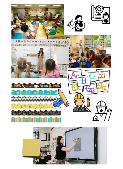
Visual Direction 1
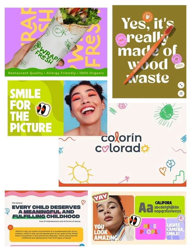
Visual Direction 2
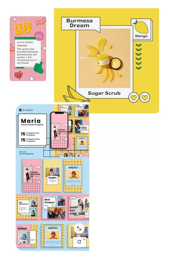
Visual Direction 3

Concept 1

Concept 2

Concept 3

Concept 4
Building on our initial moodboards, we developed four distinct creative concepts. I developed two of the directions: one evolved directly from a moodboard I created (Concept 1) independently, while the other (Concept 2) combined elements from two moodboards to form a new visual approach. The concept inspired by my original moodboard was ultimately selected by stakeholders to become the campaign's creative direction.
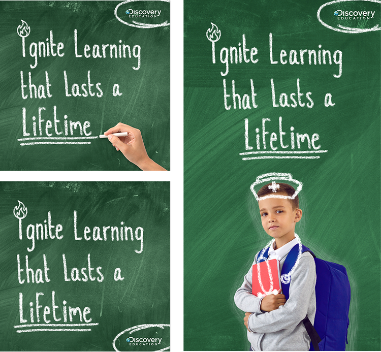
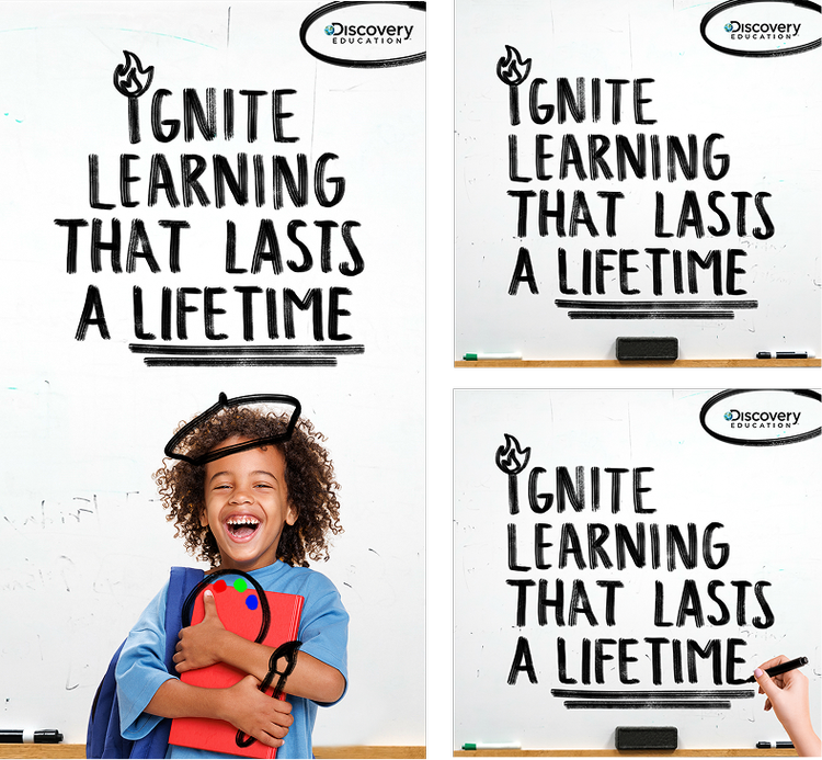
The winning concept initially featured a nostalgic chalkboard aesthetic. Following conversations with stakeholders, I developed a whiteboard-inspired direction that felt more relevant to today's classroom experience. This required reimagining the visual language, not simply changing the background. I redesigned the illustrations and typography with whiteboard-marker-inspired treatments, preserving the playful personality of the original concept while giving it a more contemporary feel.
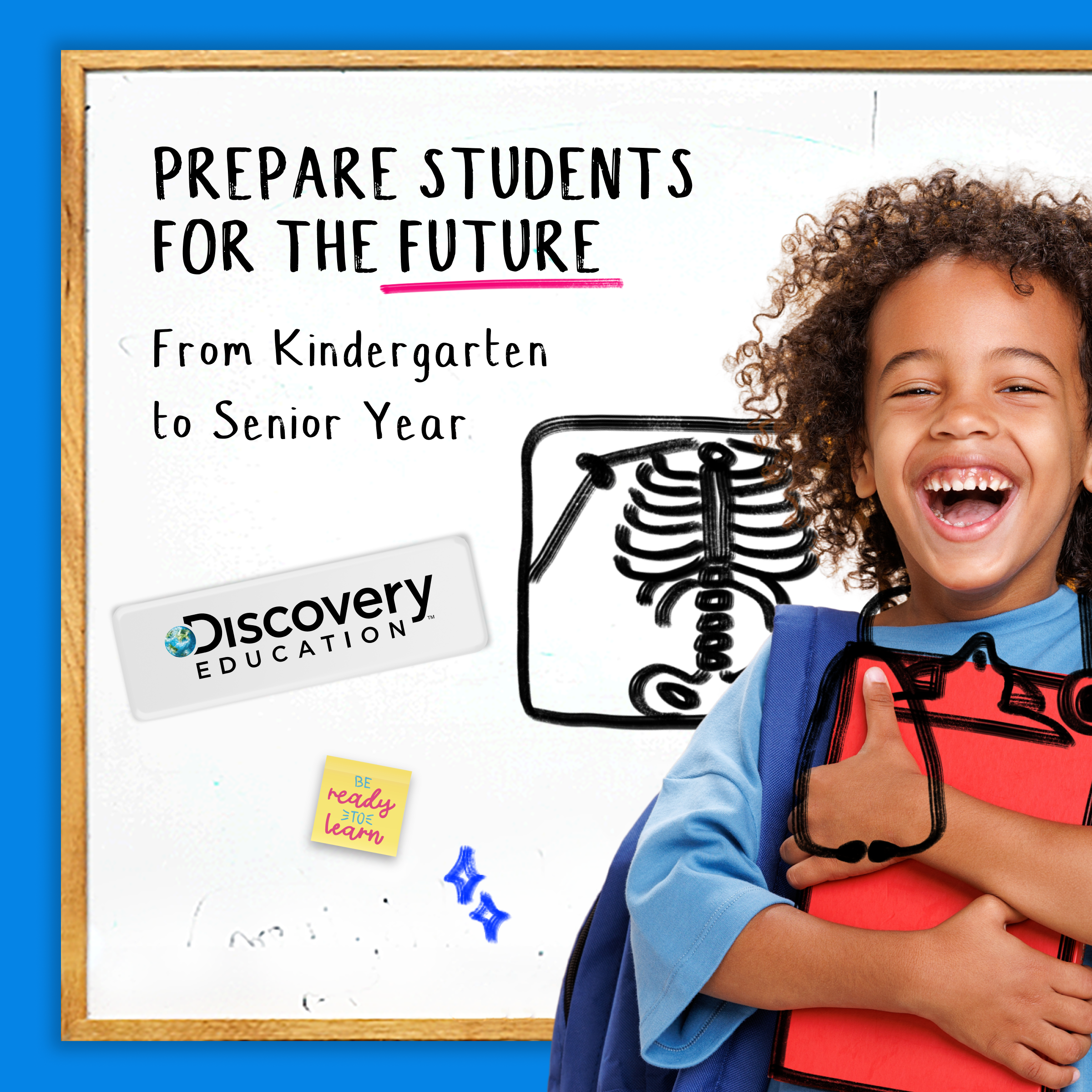
With the visual direction established, I translated the winning concept into a cohesive campaign identity. From custom typography and illustrations to supporting graphic elements, I carried the whiteboard-inspired look across campaign touchpoints, creating a recognizable and consistent experience.
Creative asset library
To bring the campaign identity to life and make it adaptable across channels, I developed a library of custom creative assets. This included PNGs of hand-drawn titles and subtitles created in Procreate, a custom web typeface based on my handwriting, supporting graphics such as magnets, sticky notes, and hand-drawn elements, a library of imagery paired with custom illustrations, and whiteboard backgrounds in various sizes for different applications.
Together, these elements created a visual toolkit that allowed our team and partners to produce consistent, on-brand assets while quickly adapting campaign content across channels.
Procreate files.
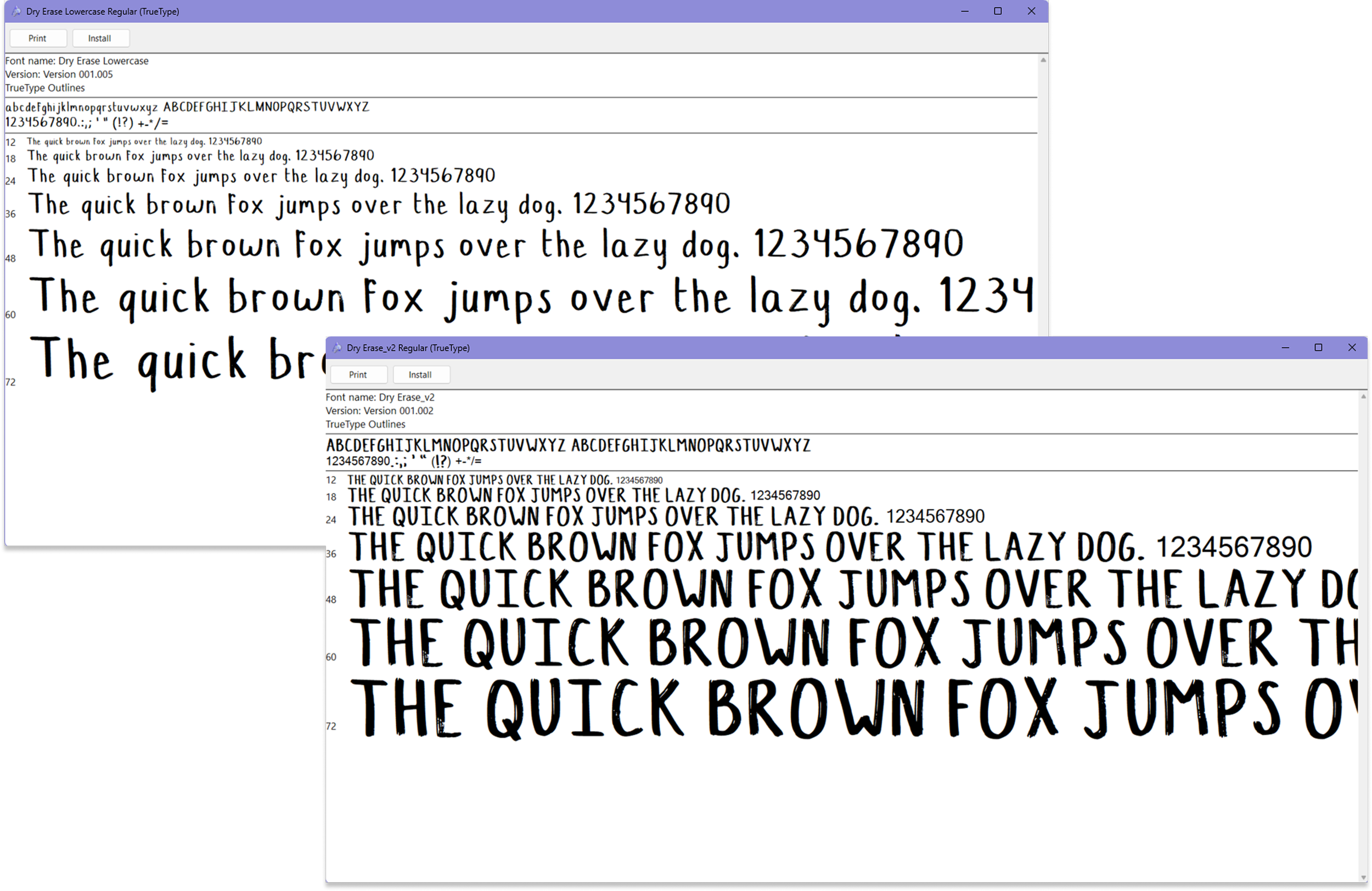
Custom web font from my handwriting.
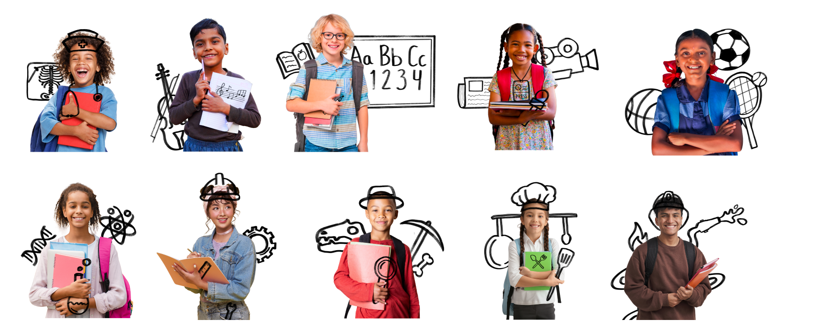
Photography with Custom Illustrations
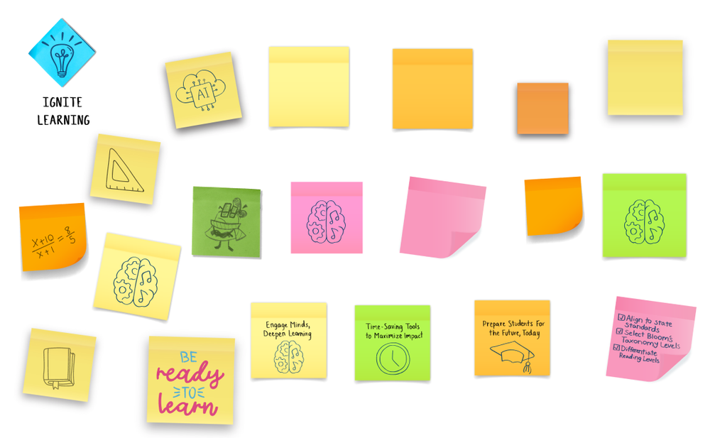
Post-it Notes
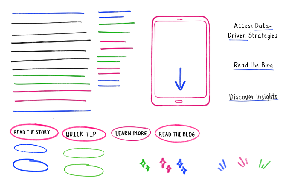
Whiteboard Graphical Elements
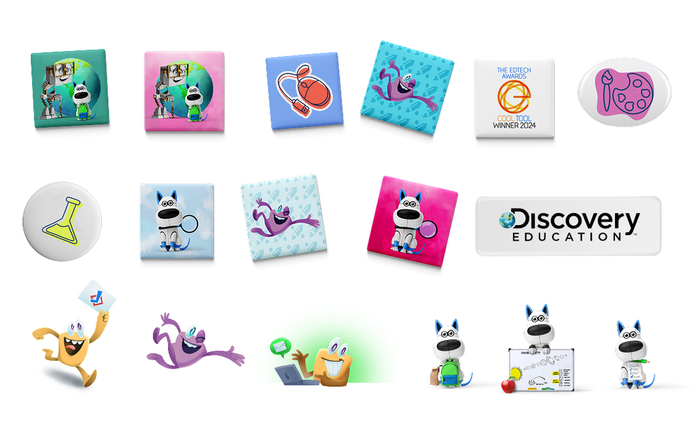
Magnets and Characters
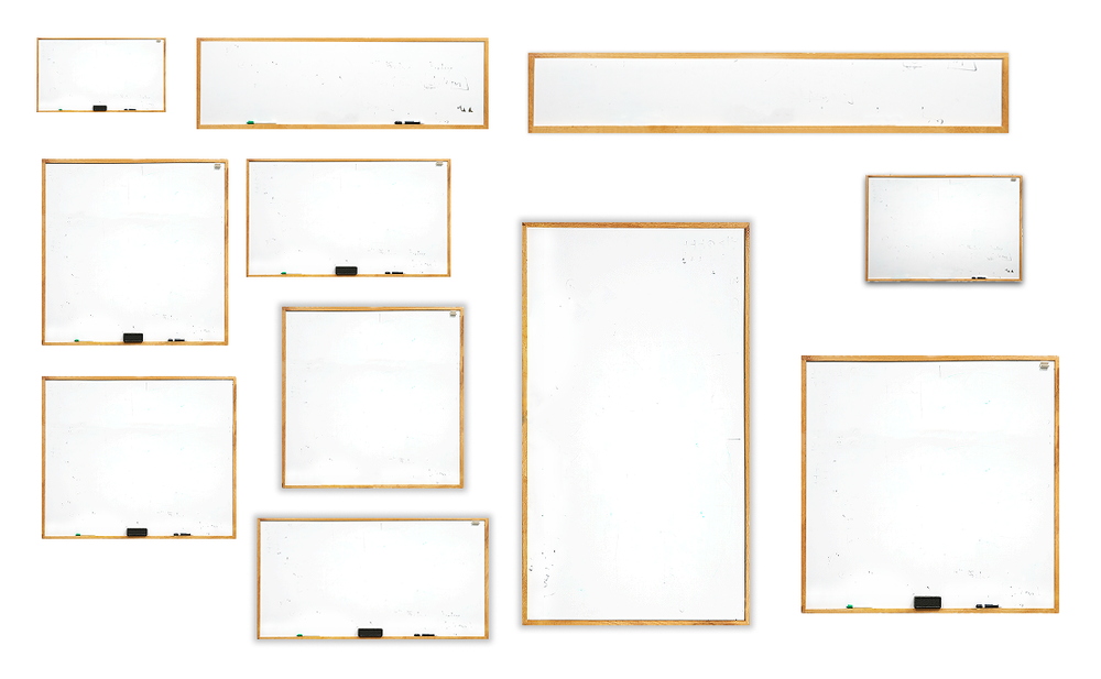
Whiteboards
Campaign Execution
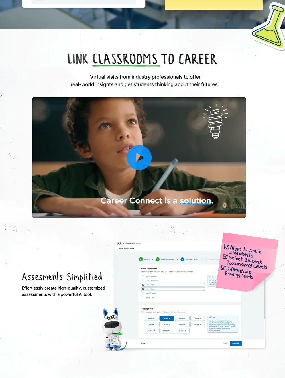
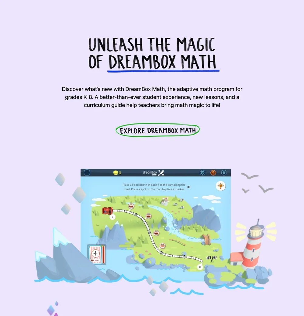
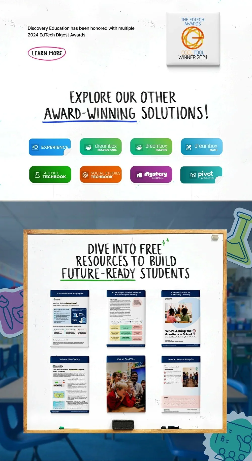
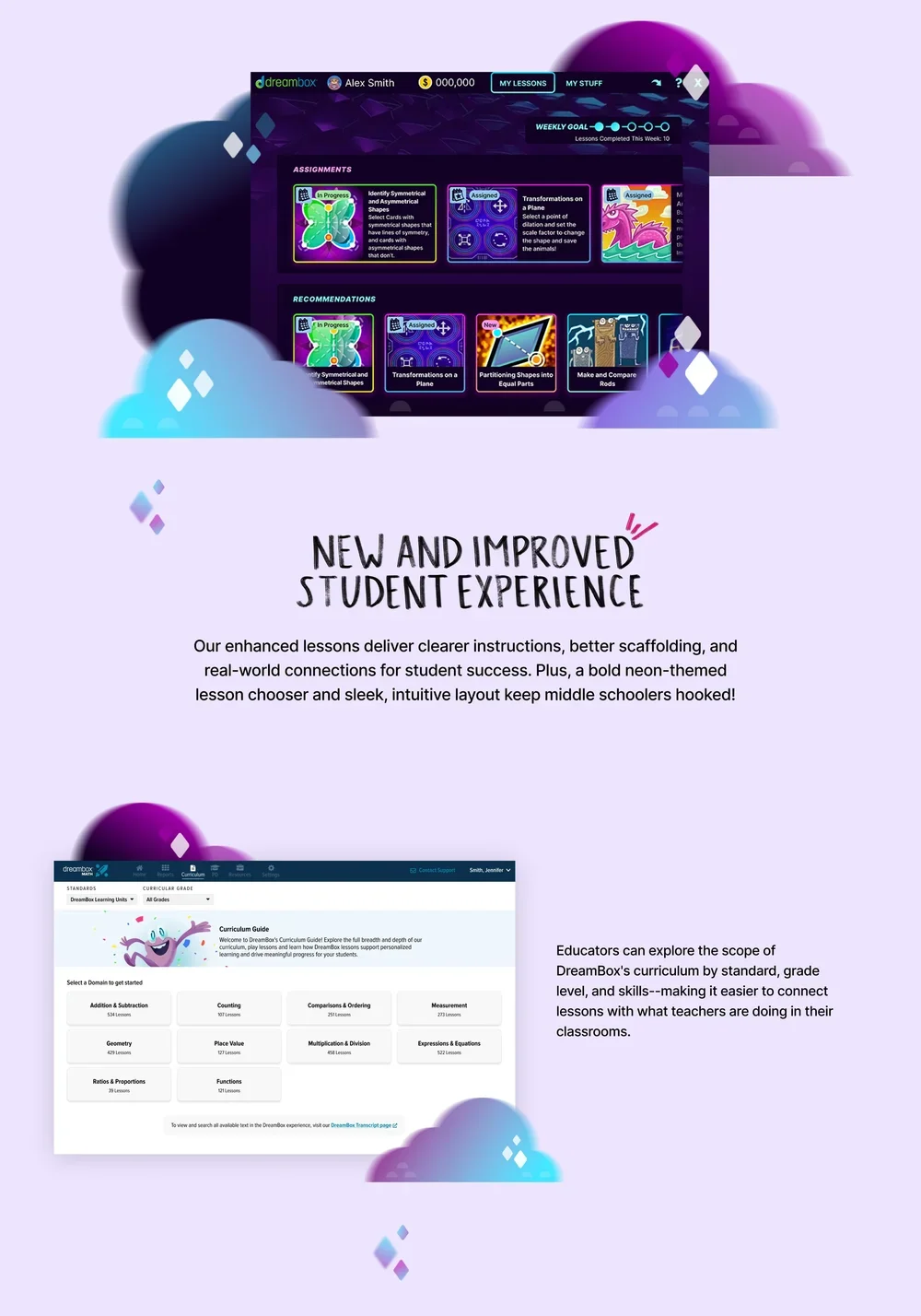
I played an integral part in designing and implementing the landing page, from the initial wireframing through to the final build. My contributions included designing the layout, creating custom graphics (many of which were digitally illustrated), and collaborating closely with the web developer to bring the page to life. The result was one of the company’s highest-performing landing pages to date.
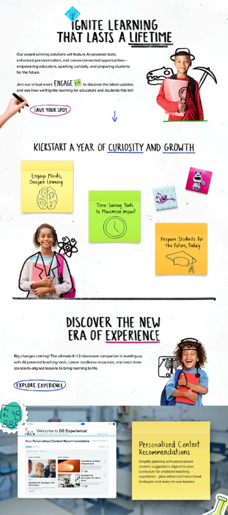
Landing Page Stills
Set 1
Set 2
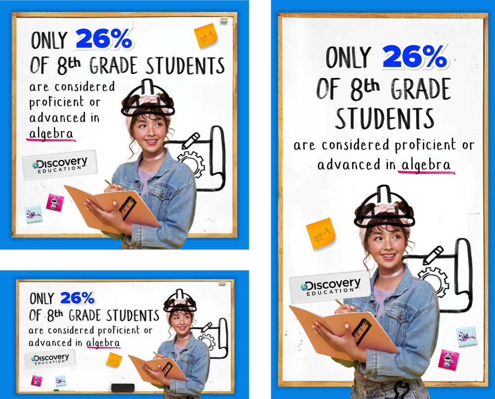
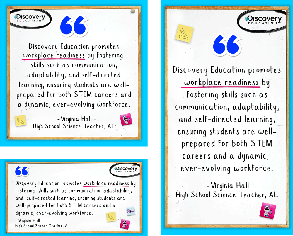
To understand which creative approach resonated most with our audience, we tested different ad variations with distinct visual and messaging treatments. The first set, which relied more heavily on visuals and less copy, generated a higher click-through rate than the second set, which featured more text-heavy layouts.
These results reinforced the value of a more visual-first approach and helped inform creative decisions as we continued optimizing the campaign.
Carousel Ad

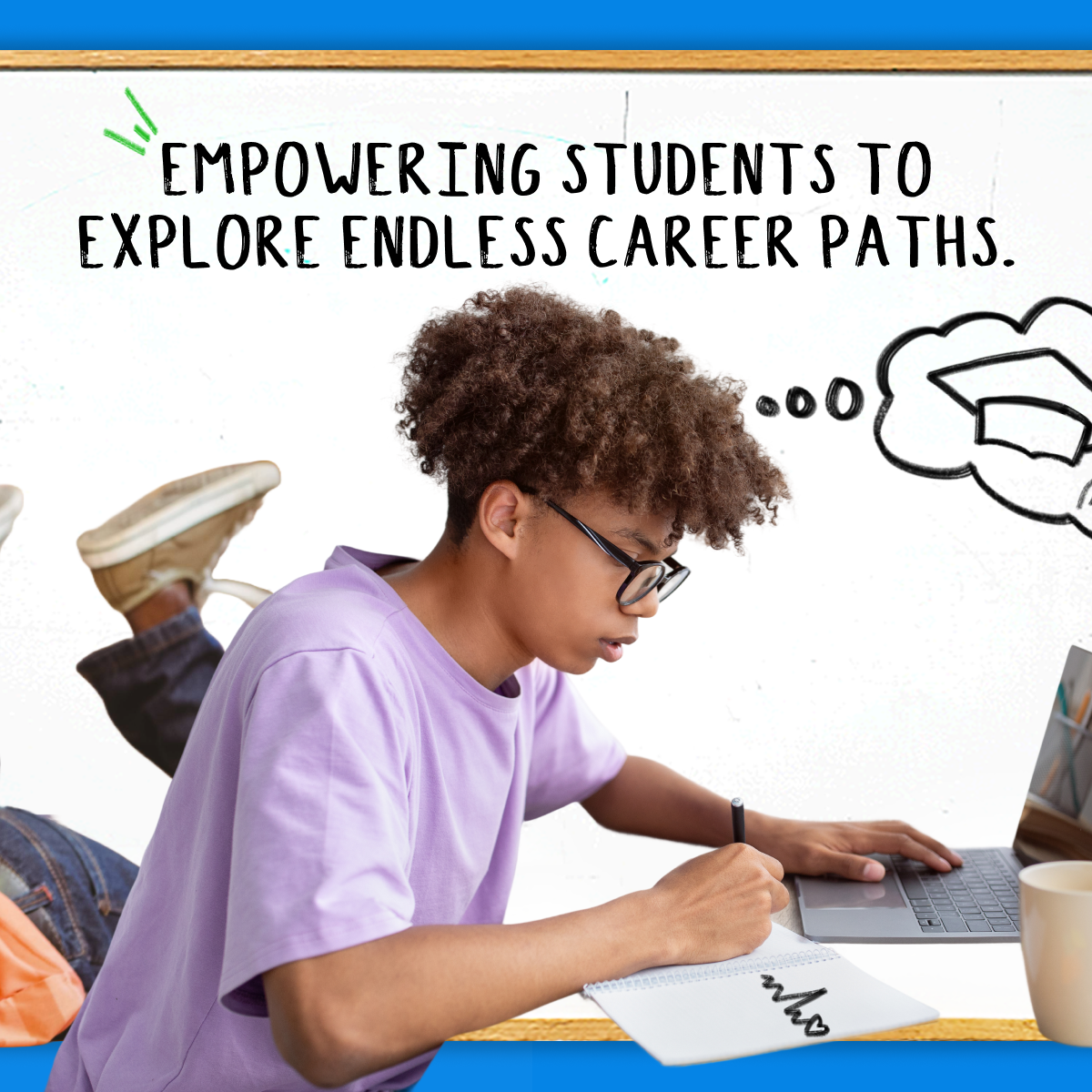

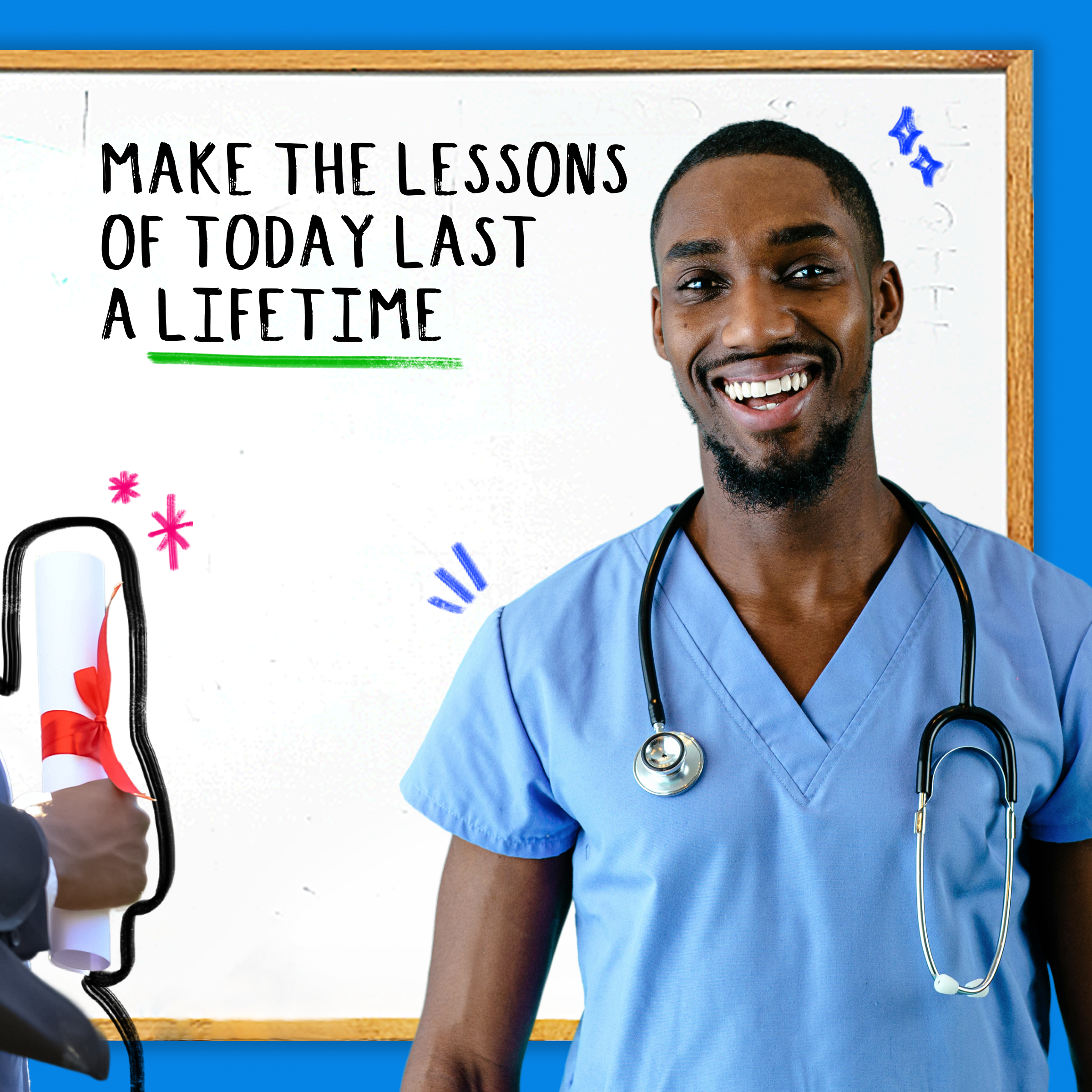
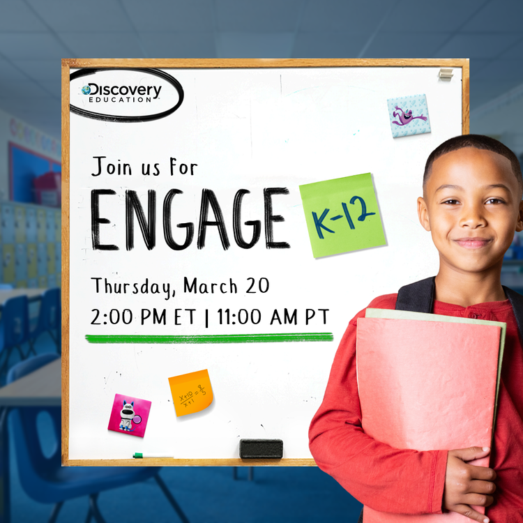
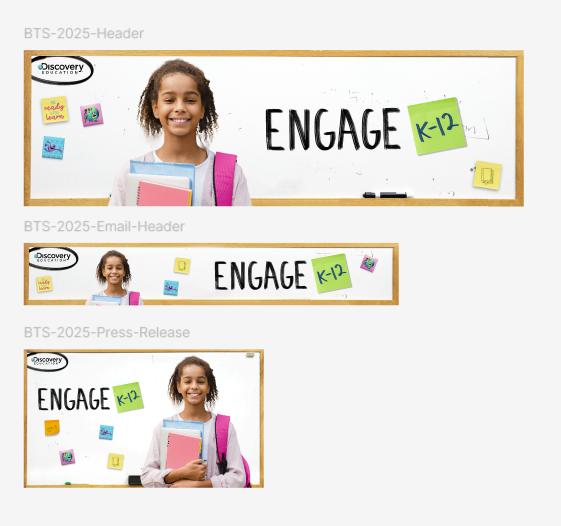
Extended the Back to School visual identity across Engage K-12 event branding and digital touchpoints, supporting an event that attracted 493 registrants—the highest registration total in company history at the time.
campaign Impact
The campaign delivered meaningful results across engagement, revenue, and lead generation. It contributed to a 250% increase in closed-won business compared to our next most successful campaign, influenced $426K in renewal revenue and $132K in new business, and generated 493 registrations for the Ignite Learning live event and 55 new Marketing Qualified Leads.
Beyond campaign performance, I helped streamline creative development and production, saving the company more than $200K year over year while building a flexible visual system that could scale across channels and future campaigns.