keeping you connected
Campaign Identity
During a time when connection mattered more than ever, Discovery Education set out to bring educators together through meaningful conversations, shared resources, and professional learning opportunities.
Originally introduced as Keeping You Connected, the initiative evolved into To What Matters Most, shifting the focus toward the people and relationships at the heart of education.
I developed a visual identity concept that brought this message to life through an unexpected human element: the handwriting of Discovery Education employees. By incorporating their individual interpretations of the phrase into the logo exploration, the goal was to create an identity that felt personal, authentic, and reflective of the people behind the organization.
My Role: Creative Concept Development, Visual Identity, Logo Exploration
Collaborators: Michelle Burleigh, Marketing Team, Employee Contributors
Channels: Brand Identity, Digital Campaign Creative, Webinar Marketing, and Video
Tools: Adobe Illustrator, Adobe Photoshop
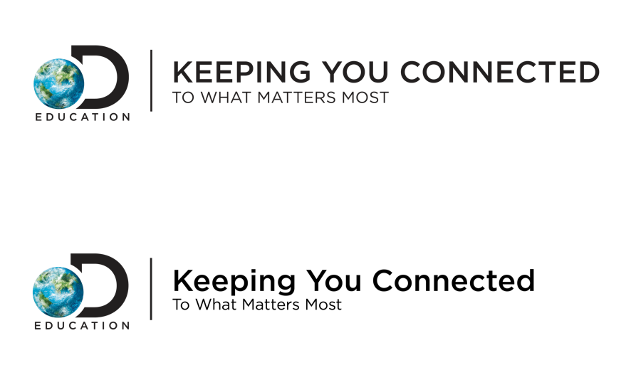
Corporate direction: clean typography, restrained colors, and structured layouts.
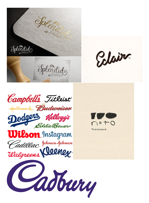
I began by exploring different visual approaches to establish the campaign's identity. This moodboard informed the selected creative direction, bringing together expressive typography, distinctive lettering, and handcrafted details to create a more personal, human-centered identity.
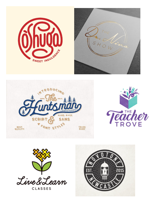
Alongside this direction, I also explored two alternative approaches: a more traditional corporate identity and a colorful, typography-driven concept adapted from a previous Discovery Education campaign.
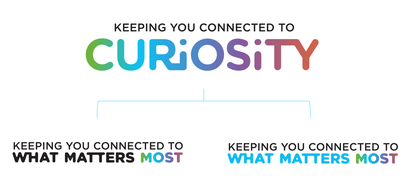
Colorful direction: adapting the bold typography and vibrant gradients from a previous Discovery Education campaign.
the vision
To bring the concept to life, I invited Discovery Education employees to handwrite the phrase "To What Matters Most." The submissions introduced a range of personal lettering styles, each bringing its own character and personality to the campaign.
I gathered the contributions and explored how each interpretation could translate into a visual identity, turning employee participation into an integral part of the creative process.
the final
After collecting the submissions, I explored how different handwriting styles could be incorporated into the Discovery Education logo. I digitized a selection of the entries and developed several logo variations, experimenting with how the lettering worked alongside the existing brand identity.
I presented the concepts to stakeholders, who selected the final direction for the campaign.
Beyond the logo
The visual identity was part of a larger effort to keep educators connected to the resources, tools, and support available through Discovery Education. Through a combination of video content and virtual programming, the initiative communicated how Discovery Education could continue supporting educators during a challenging time.
A campaign sizzle highlighting Discovery Education's offerings, resources, and the ways it supports educators.
A presenter-led walkthrough highlighting specific Discovery Education resources and how they support teaching and learning.
the impact
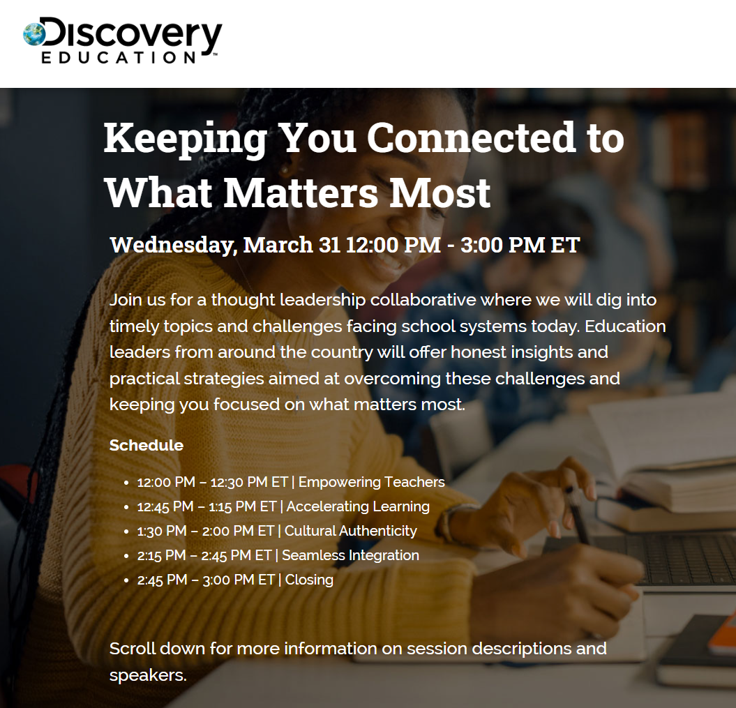
The initiative culminated in the Keeping You Connected to What Matters Most virtual event on March 31, 2021. Educators and school leaders came together for conversations around the challenges facing education and strategies for moving forward.
Campaign Impact
154 leads associated with the campaign
119 associated opportunities
$2.09M in total opportunity value
$521K in won opportunity value
Source: Discovery Education Salesforce campaign record, Q1 2021. Opportunity values reflect records associated with the campaign.