powering progress
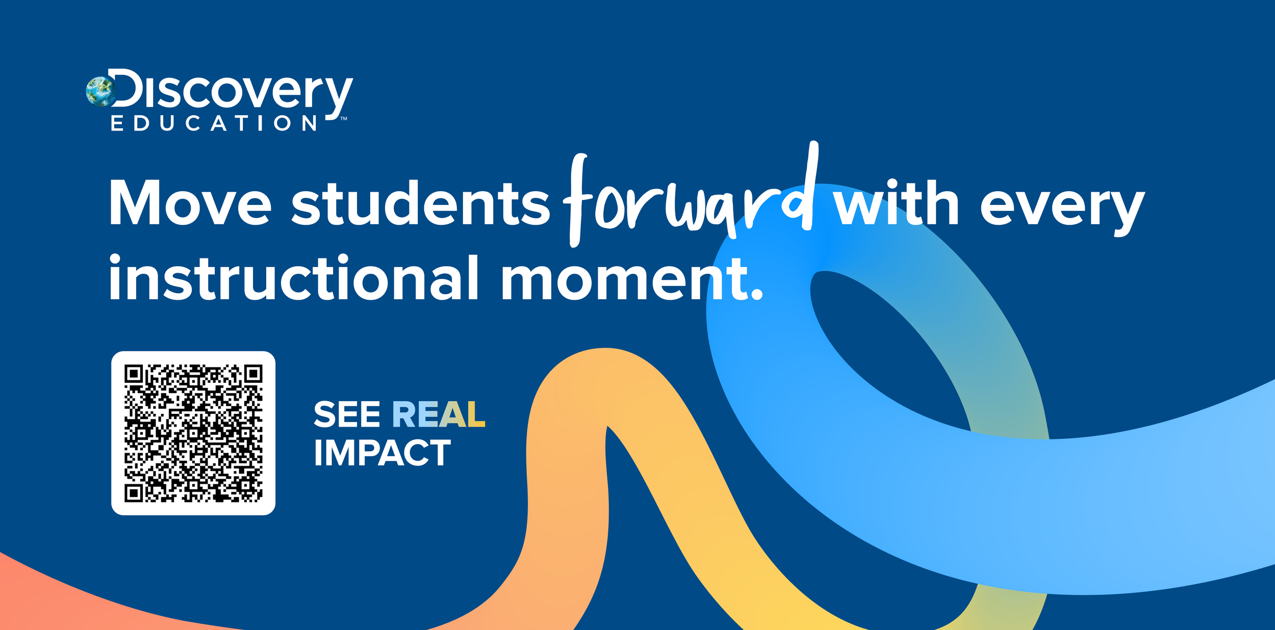
Following the success of the Back to School campaign, Discovery Education sought to bring more personality to its broader brand. The goal was to evolve that playful aesthetic into a more refined, versatile identity that retained its warmth while appealing to a broader professional audience.
This vision took shape through Powering Progress, a new creative direction for the brand’s conference presence, beginning with FETC. Working alongside the Senior Creative Director and design team, I helped develop the visual language that ultimately became the foundation of Discovery Education’s new identity, contributing to its guidelines and rollout across marketing, digital, and event experiences.
My Role: Brand Development, Visual Design
Collaborators: Andrew Izkowitz, Scott Baker
Channels: Experiential & Event Design, Brand Identity & Guidelines, Digital & Paid Advertising, Social Media, Print & Marketing Collateral
Tools: Adobe Illustrator, Adobe Photoshop, Adobe InDesign, Figma
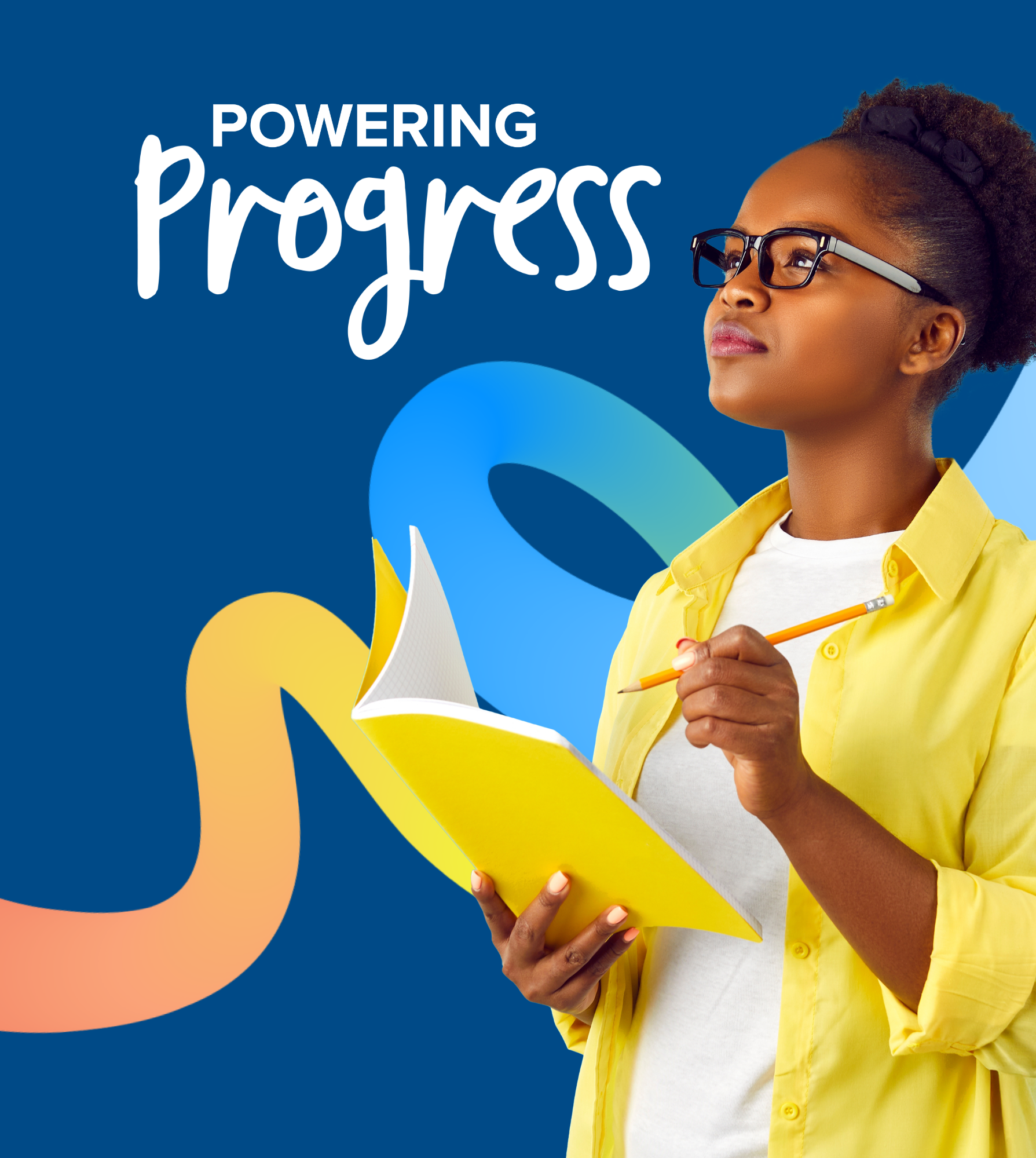
I explored different visual approaches to bring the Powering Progress concept to life, experimenting with color, typography, photography, and graphic elements. Each exploration offered a different way to balance Discovery Education's playful personality with a more polished, professional look.
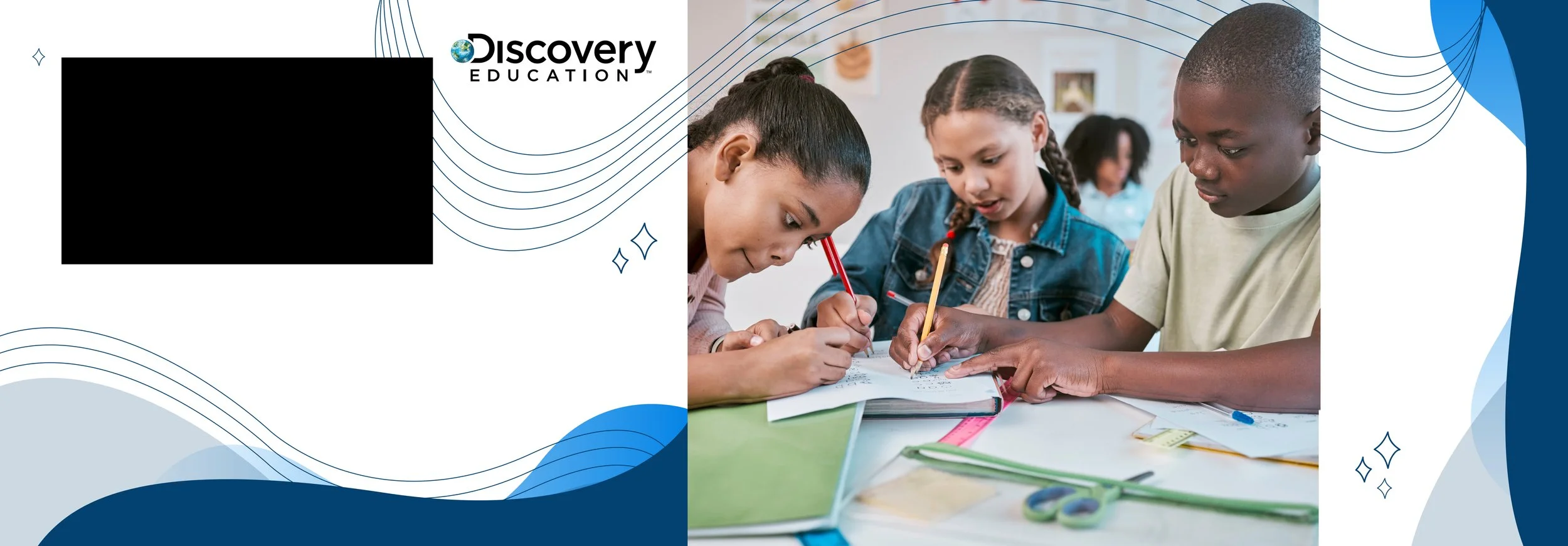
Early Creative Explorations
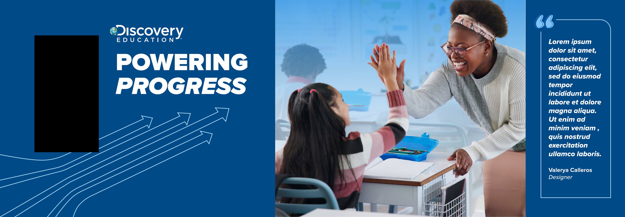
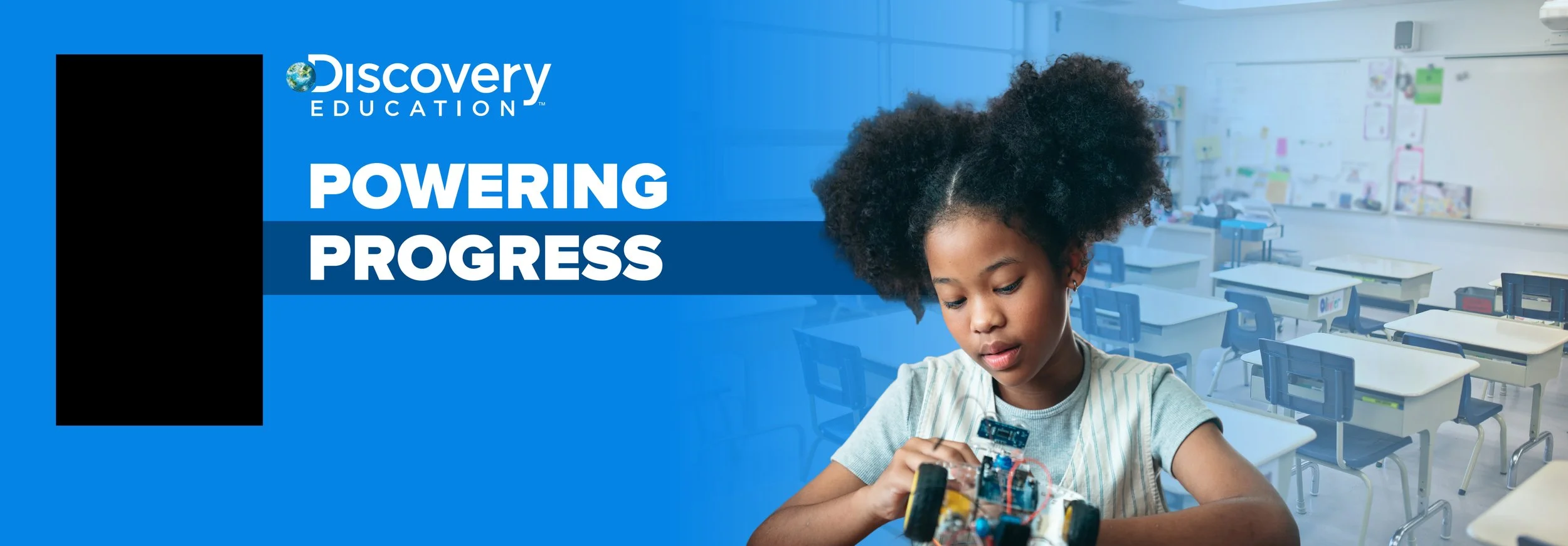
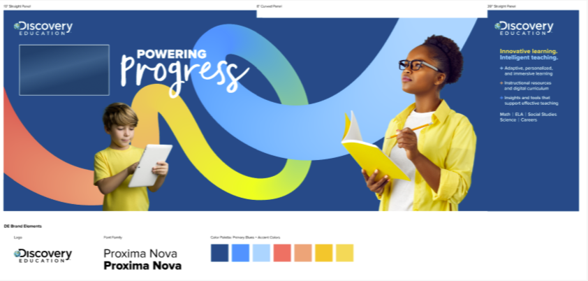
Through collaboration and refinement with the team, we landed on a direction that felt both energetic and cohesive, creating a distinctive visual foundation for the conference experience.
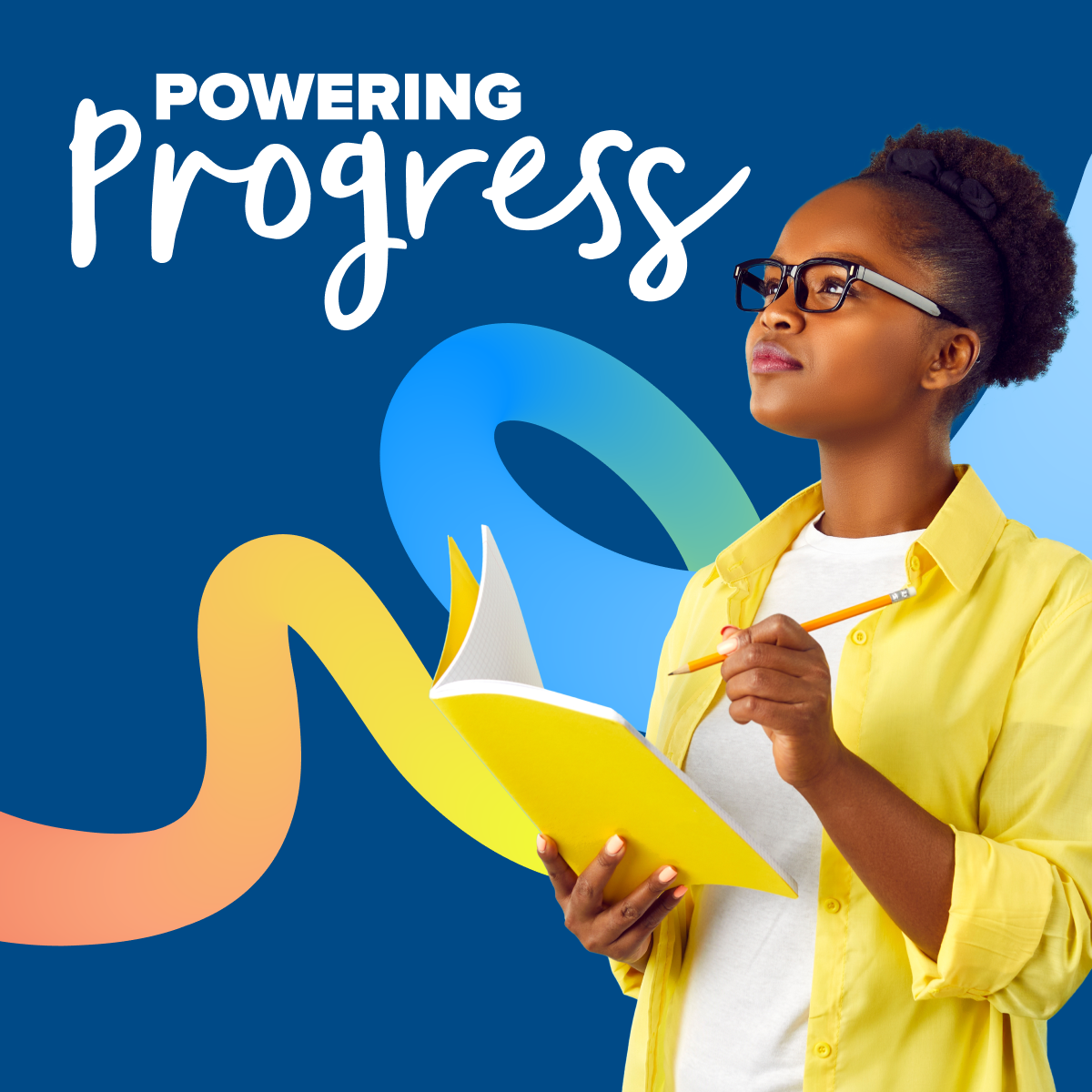
The selected direction brought together bold typography, a vibrant palette, dynamic graphic elements representing progression, and authentic classroom photography.
Building a cohesive brand system
To ensure consistency across every touchpoint, we developed a comprehensive set of brand guidelines outlining the visual elements, design principles, and applications that defined the new identity. The 71-page guide gave teams across the organization a shared foundation for bringing the brand to life.
Below are selected excerpts from the brand guide, offering a closer look at the visual standards and principles behind the identity.
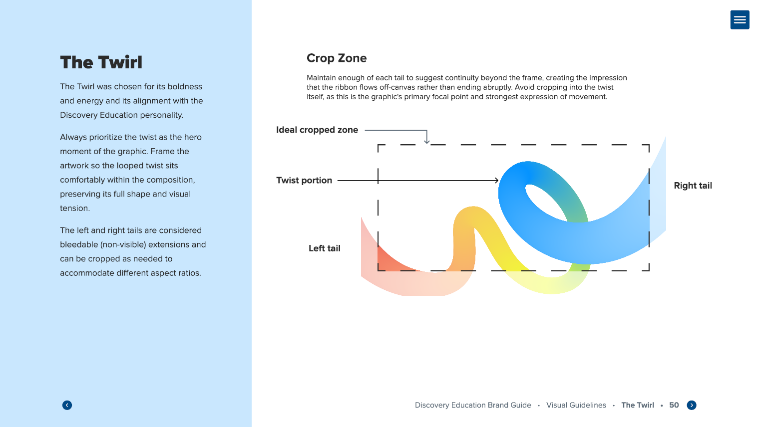
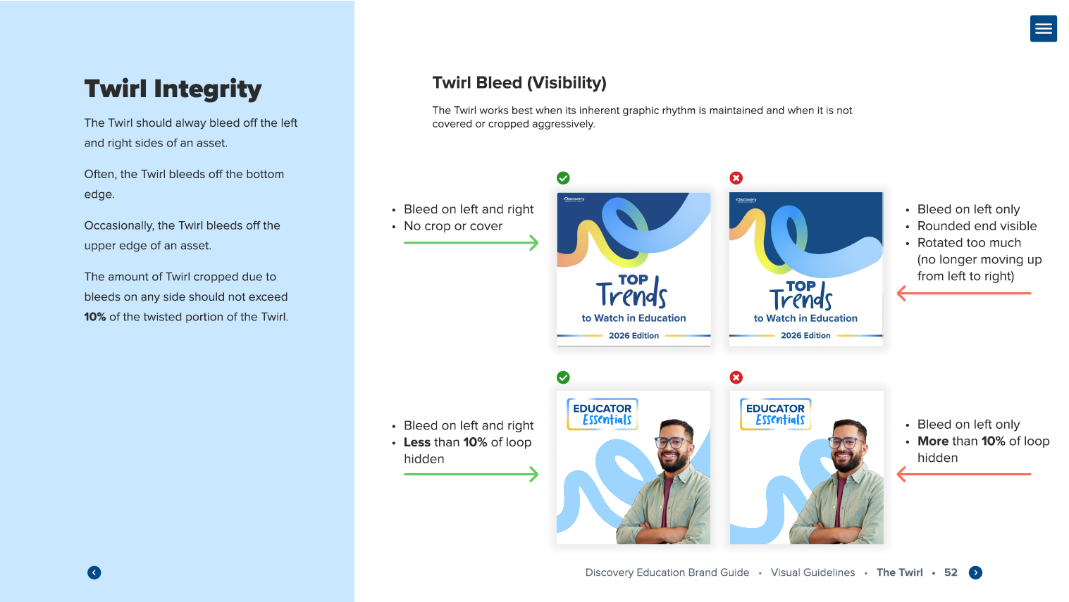
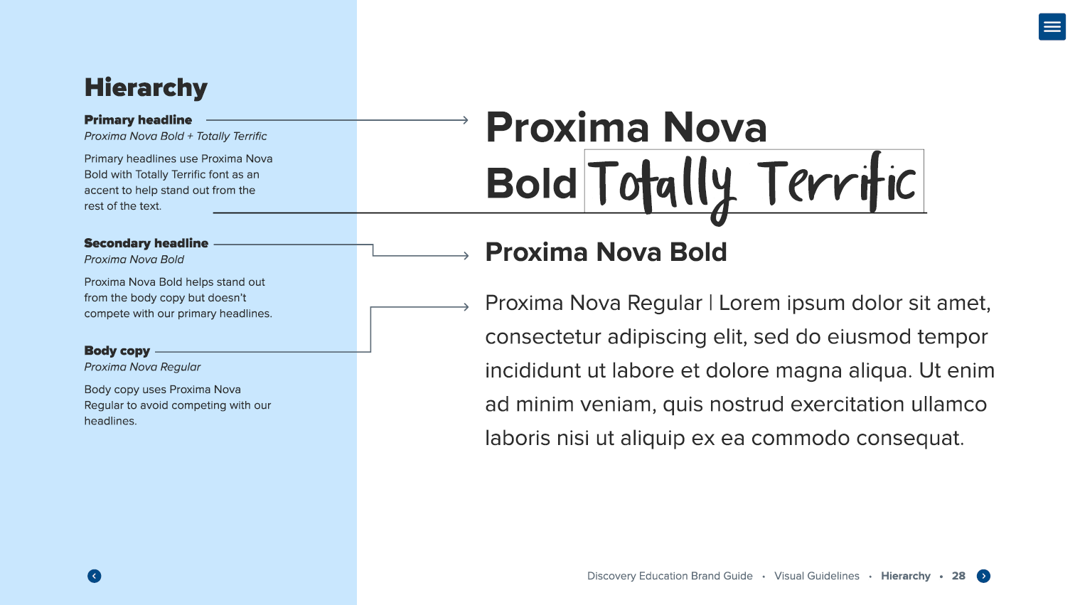
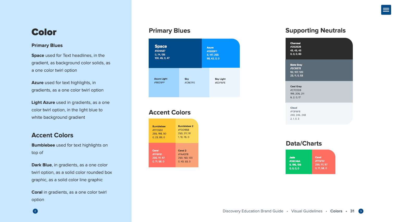
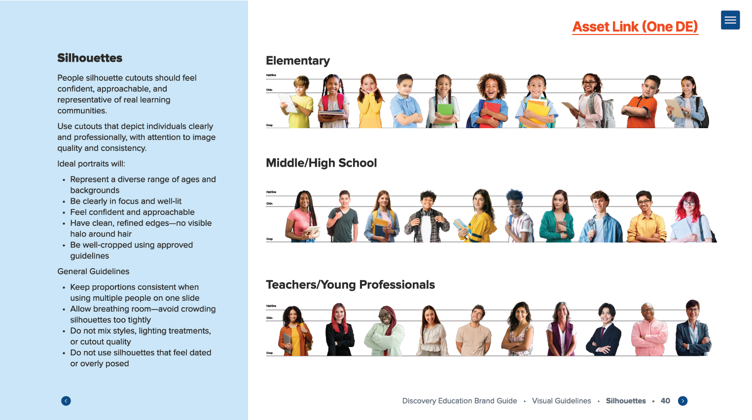
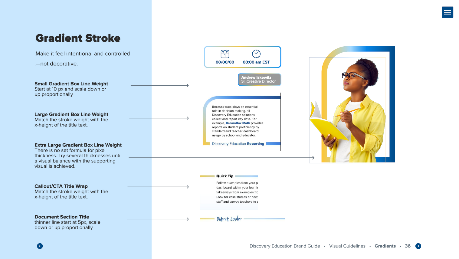
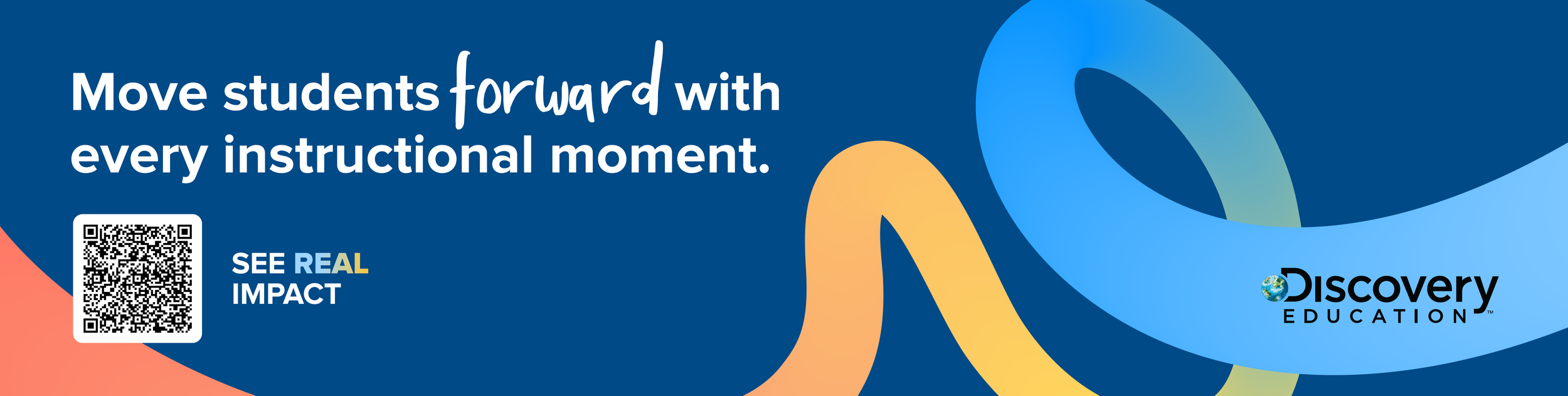
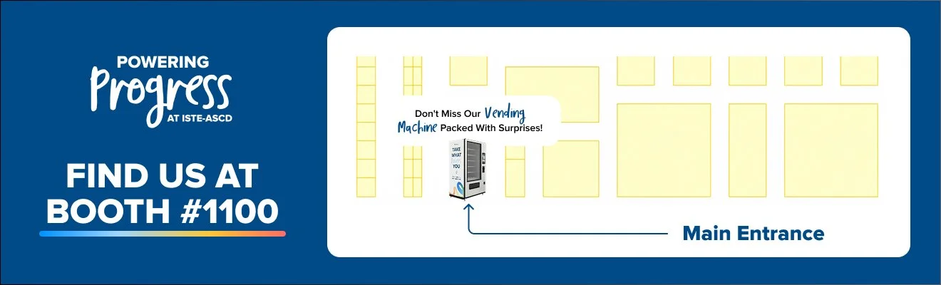
With the visual identity established, we began applying the new look across Discovery Education's conference presence. From booth graphics and environmental signage to supporting event materials, each touchpoint brought the Powering Progress identity into the physical space, creating a cohesive and recognizable brand experience.
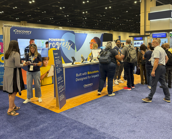
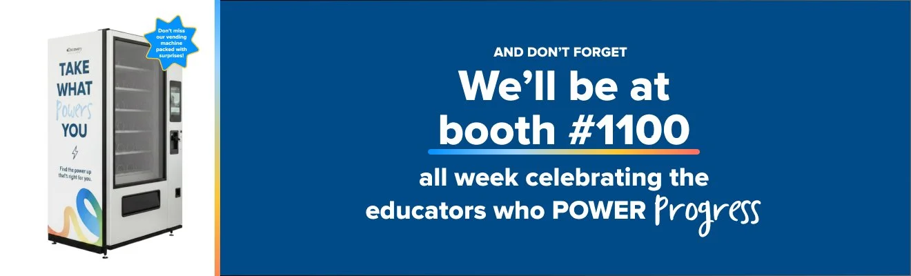
The selected direction was brought to life through a range of conference applications, transforming the visual identity into a cohesive, recognizable experience across event environments, signage, promotional materials, and branded merchandise.
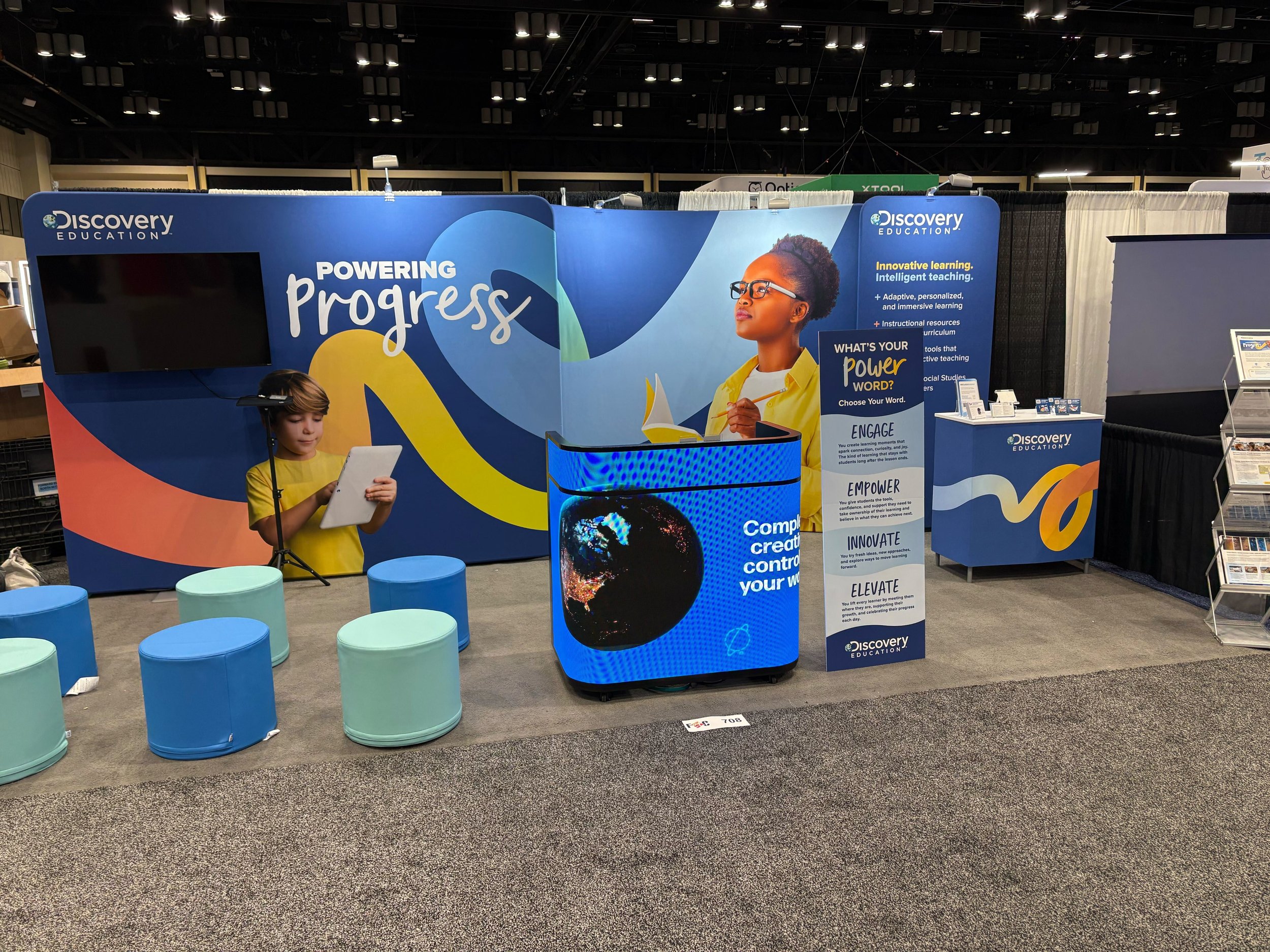
Final booth design
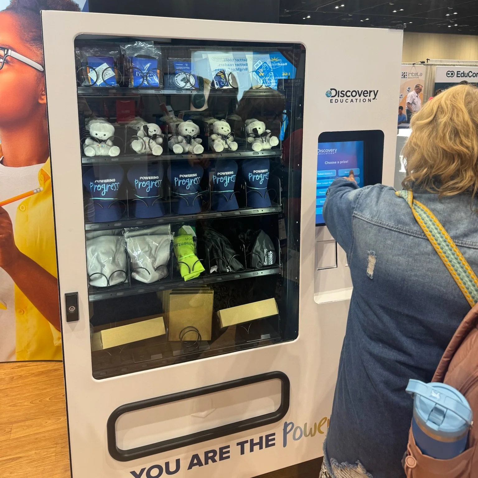
Swag vending machine
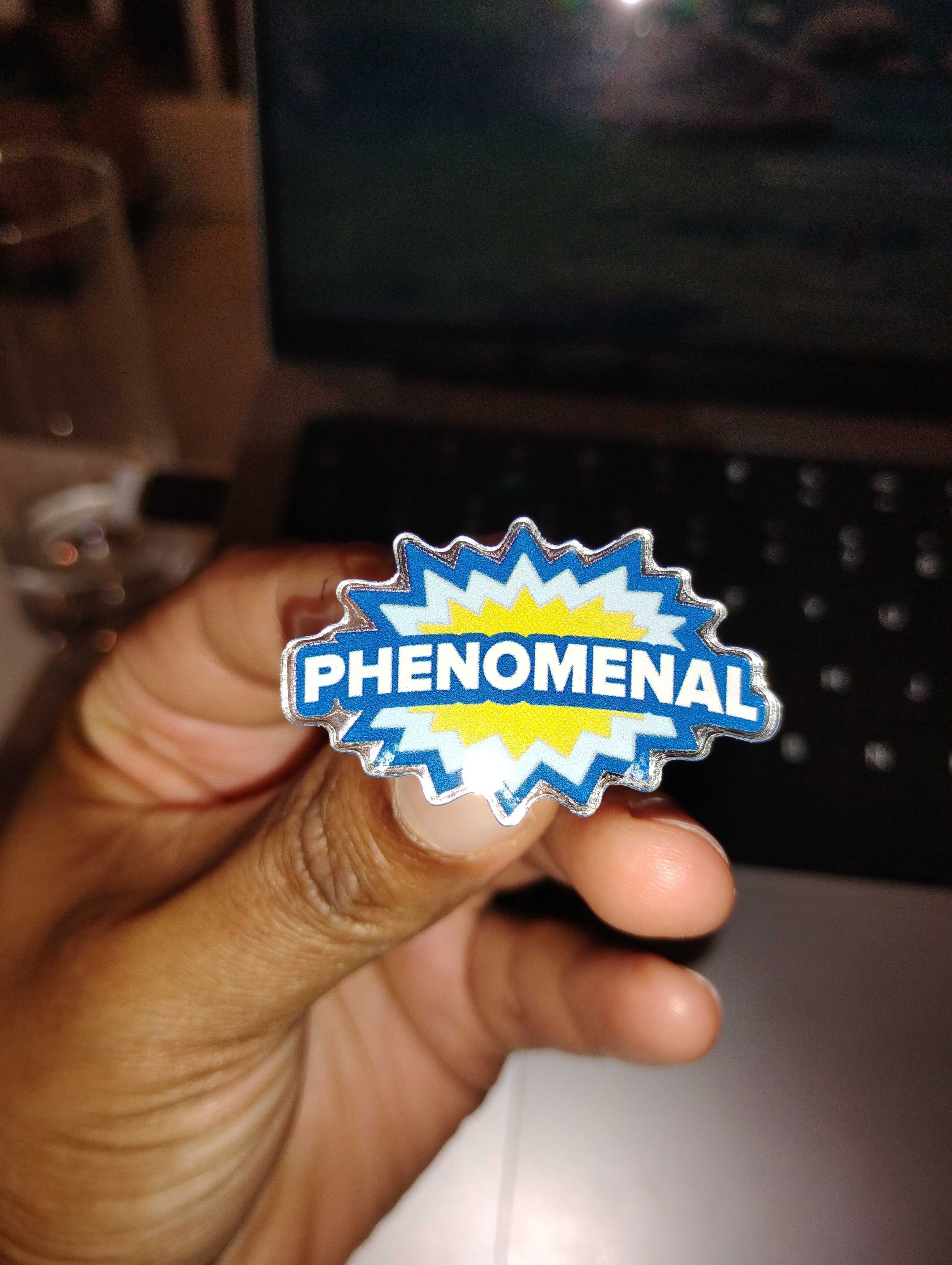
Phenomenal pin
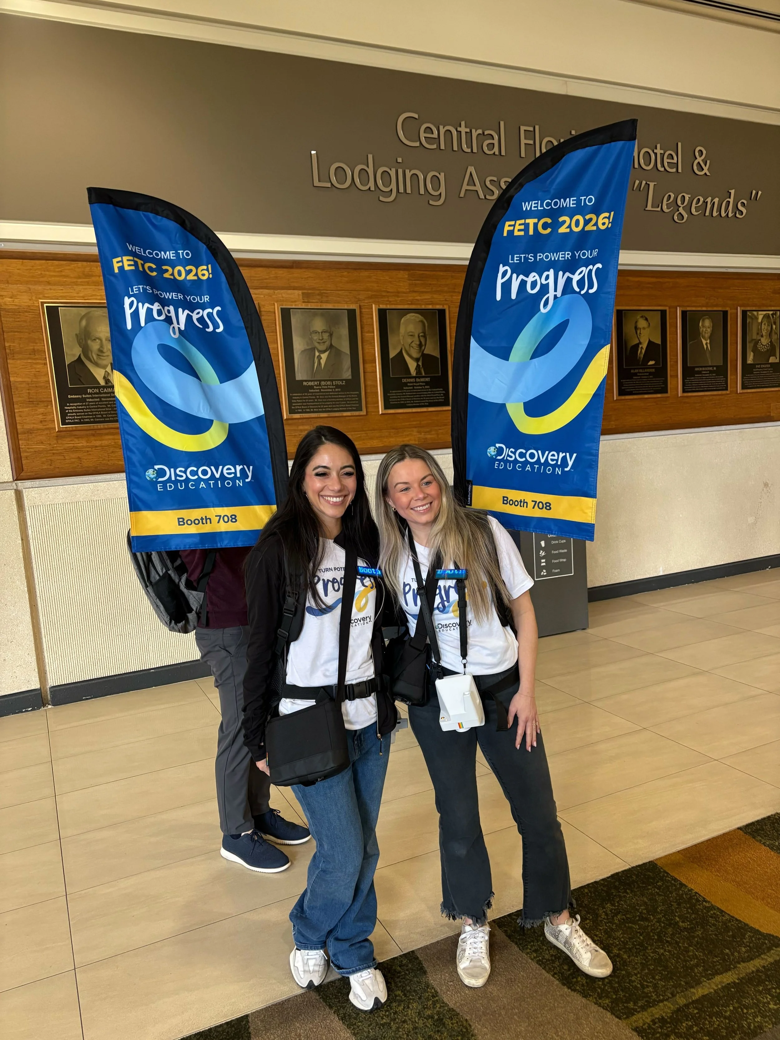
Backpack flags
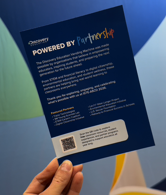
Postcard flyer
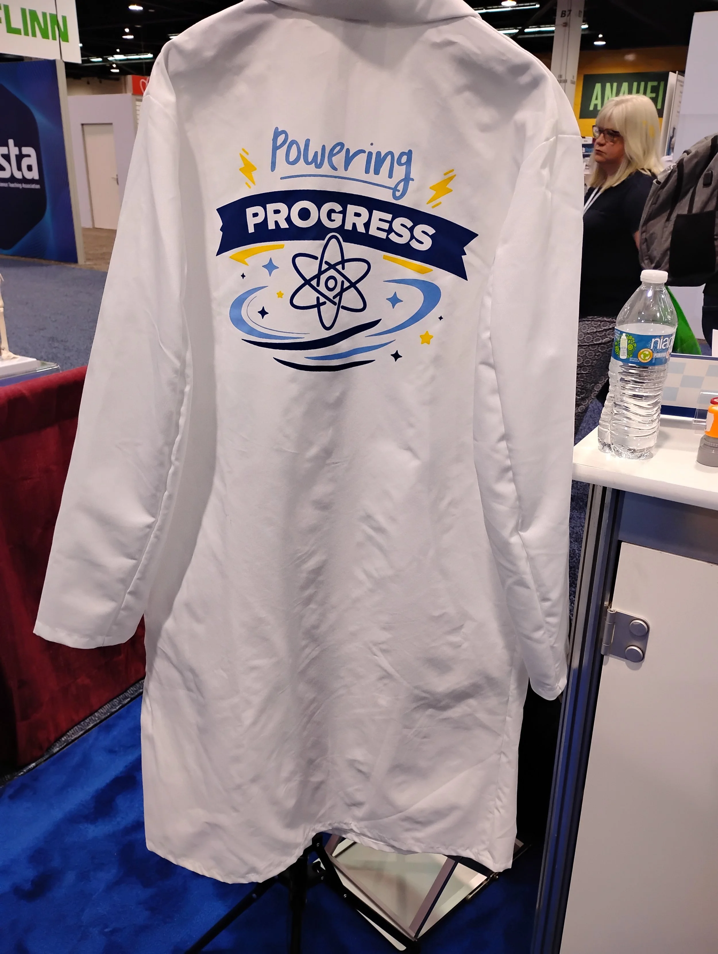
Lab Coat Merch
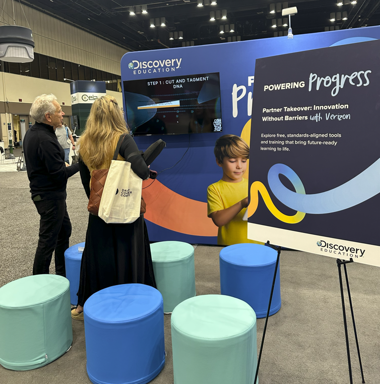
Easel sign
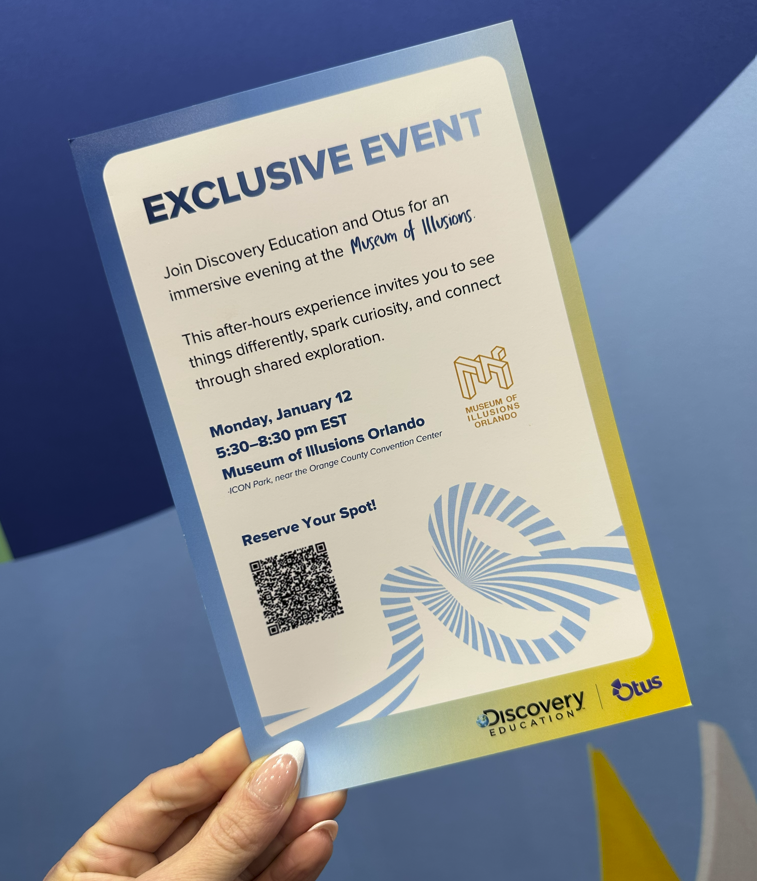
Invite
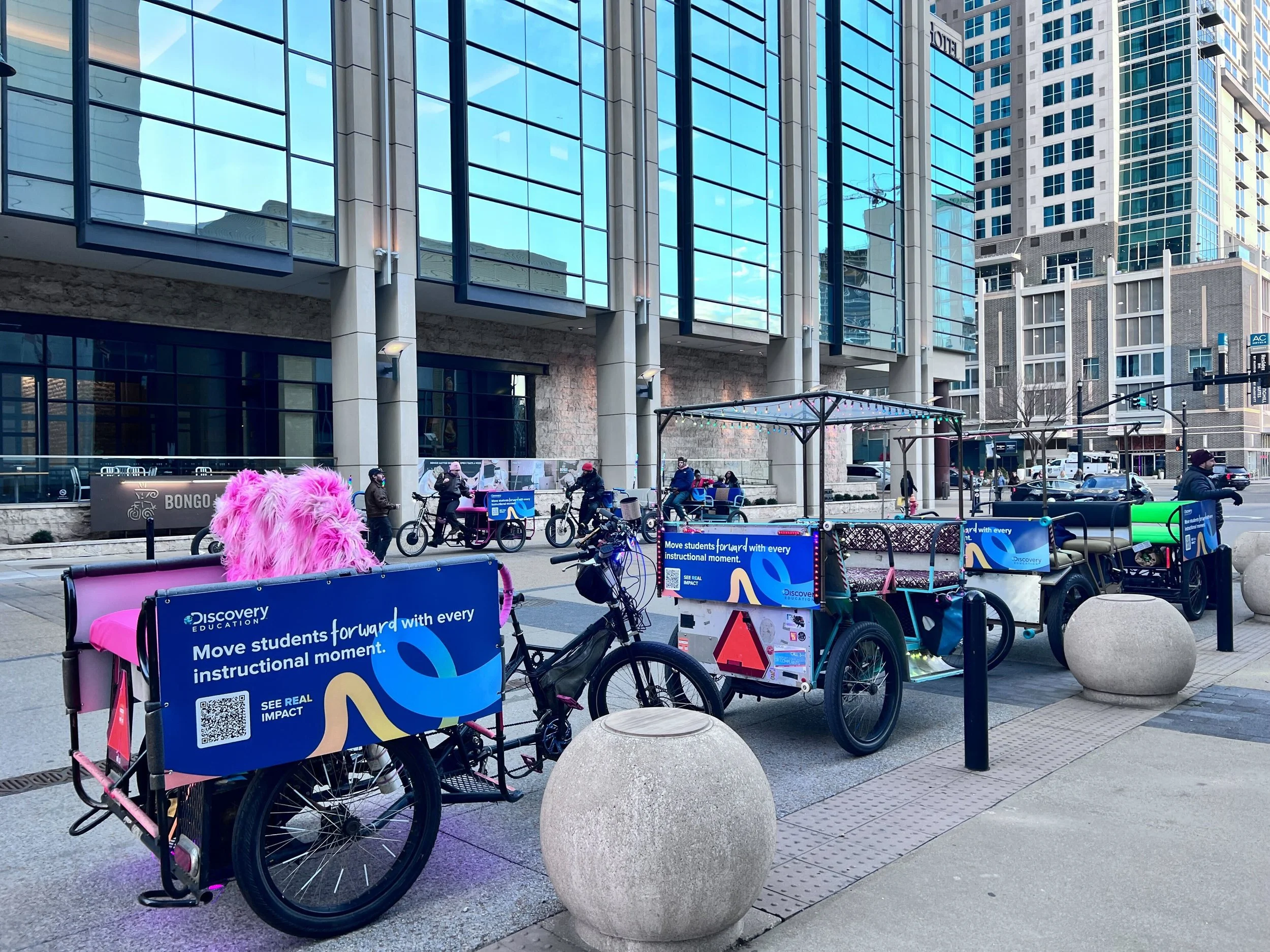
Pedicabs
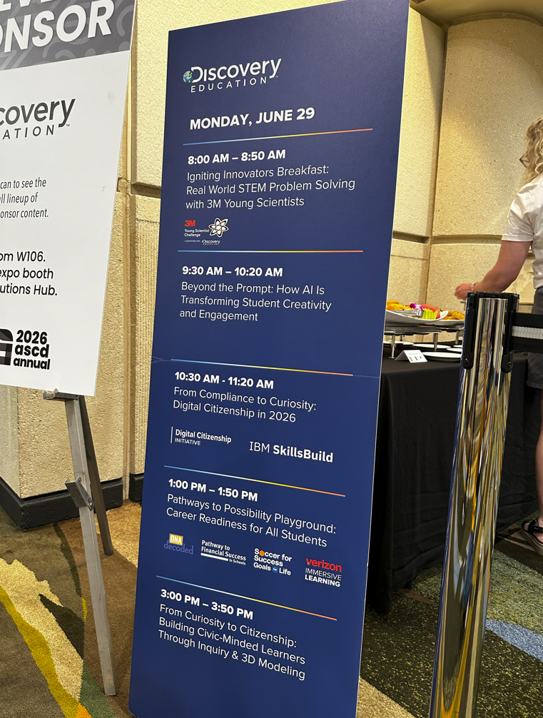
Standee
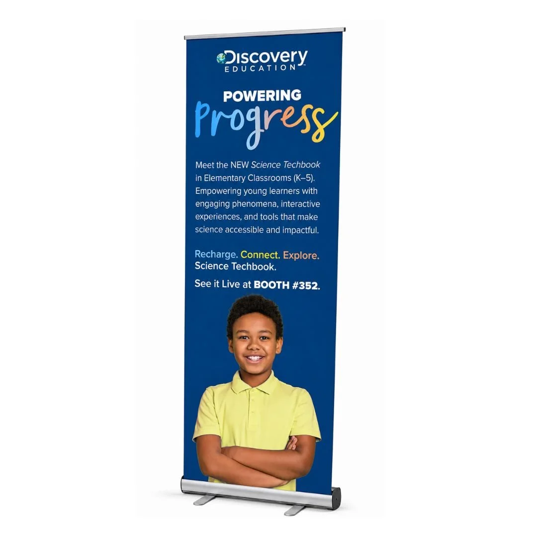
Standee



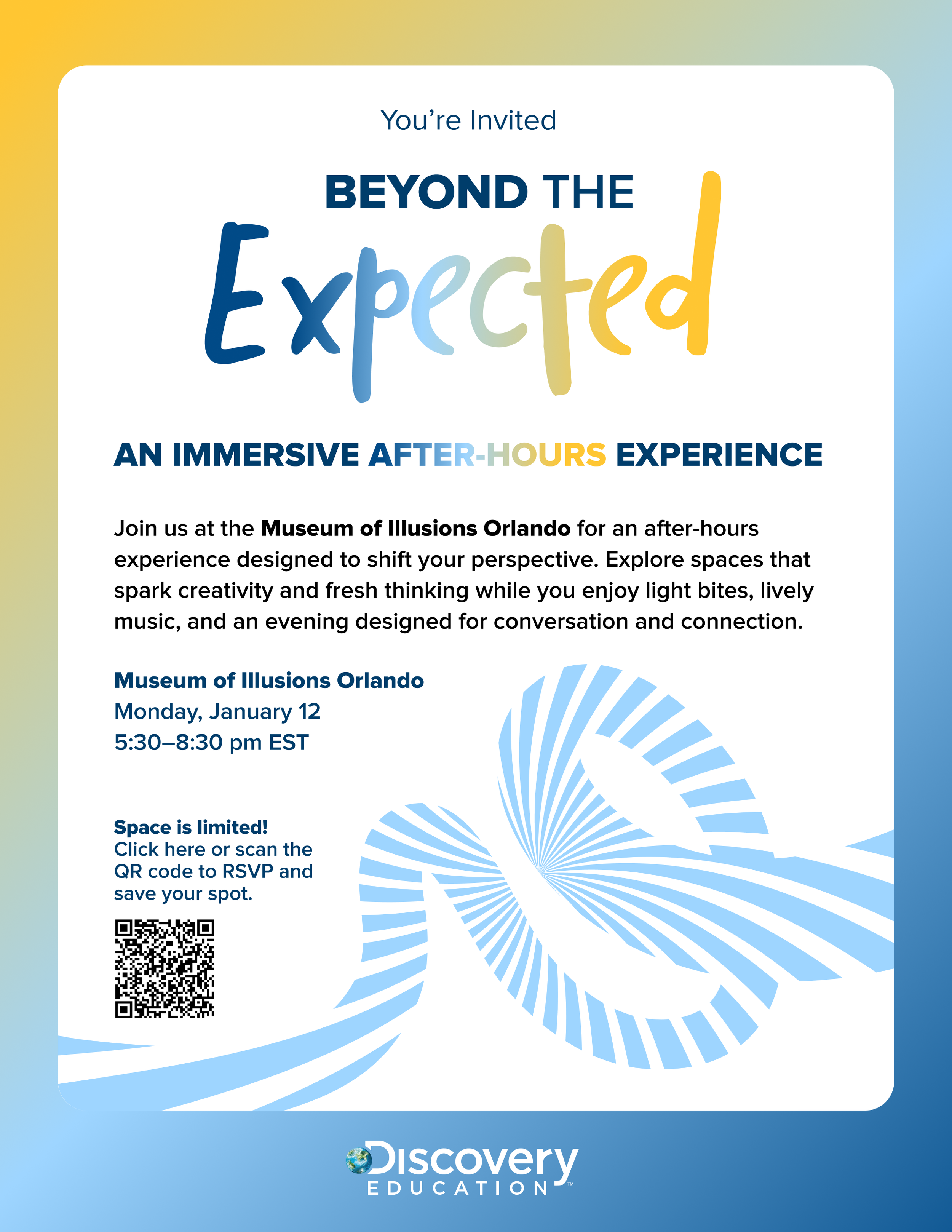
The Powering Progress identity was also adapted for two distinct After Hours experiences, each designed around a different audience and atmosphere. While both retained the signature swirl graphic as a unifying element, the creative direction shifted to suit each event, from a playful, immersive concept inspired by the Museum of Illusions to a more refined and elevated experience for district leaders.
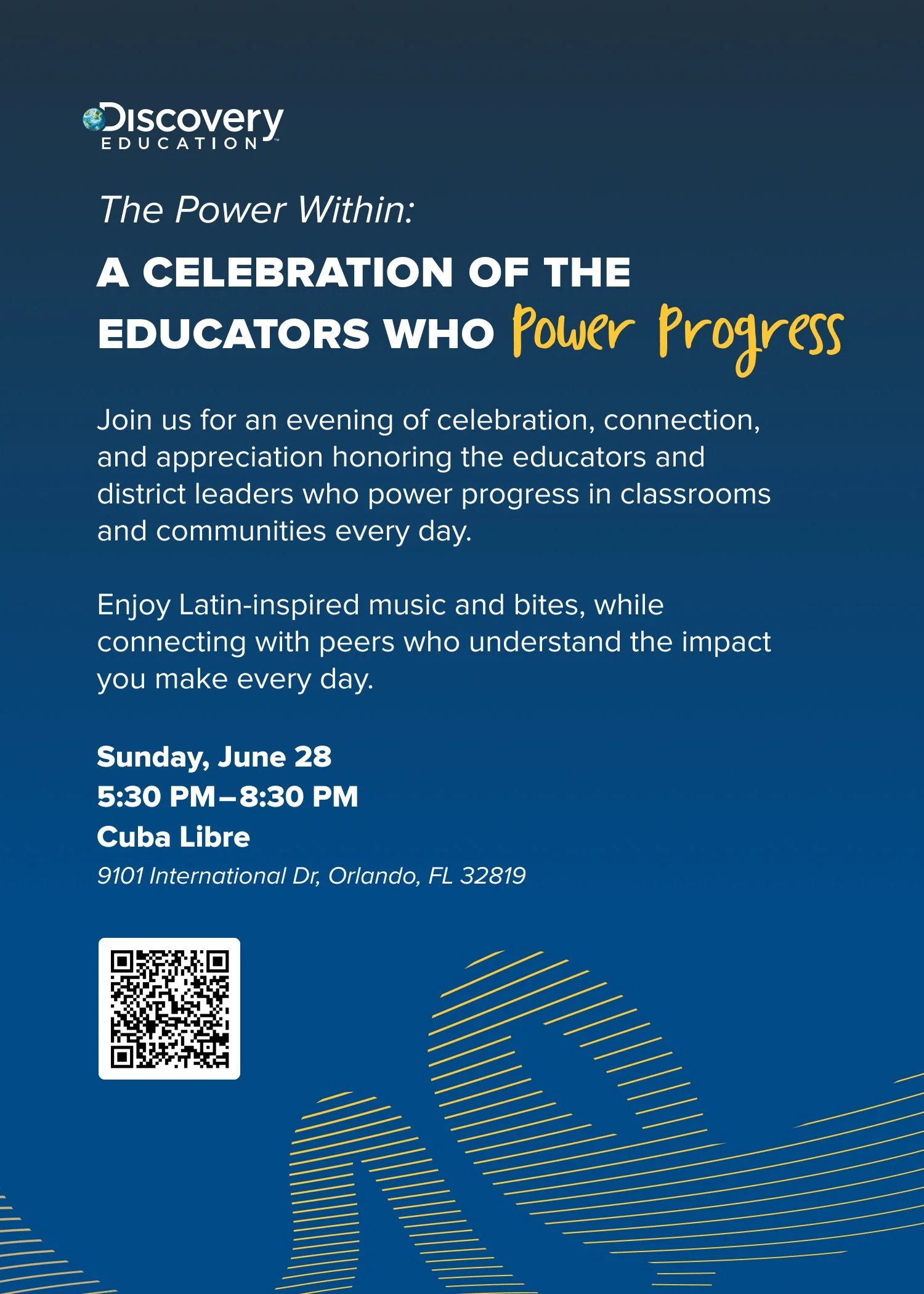
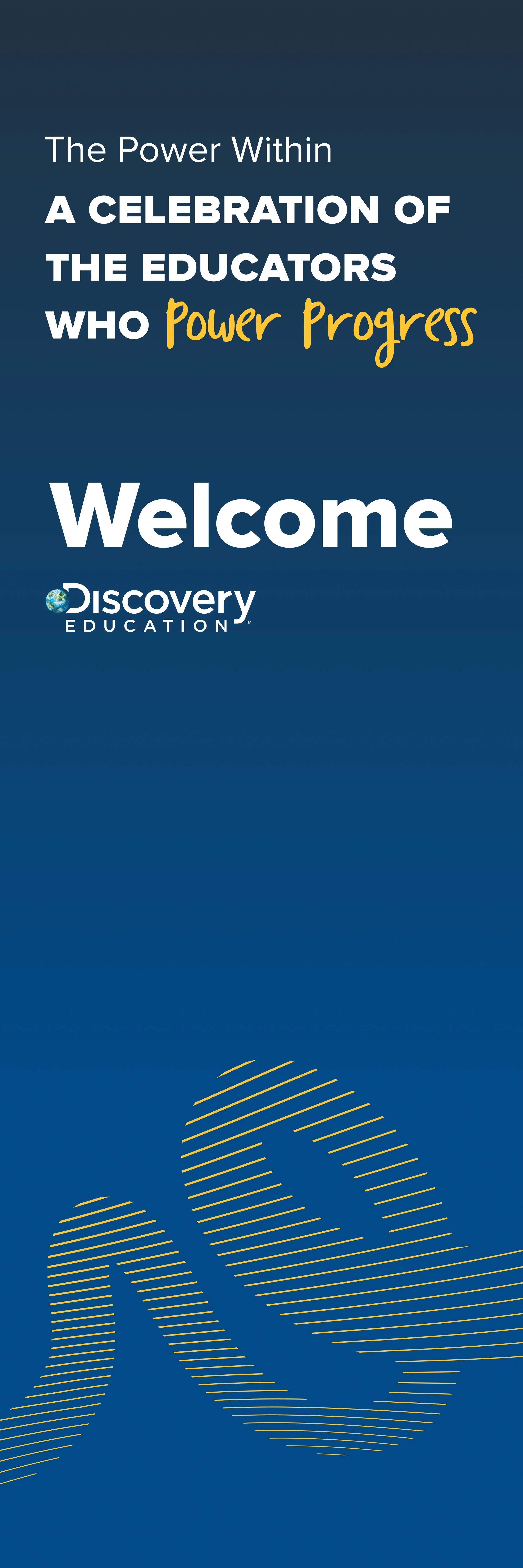

A more refined expression for district leaders.
For an audience of superintendents and district leaders, the visual direction took on a more elevated, sophisticated feel. A deeper navy palette, confident typography, and restrained graphic details created a polished event identity while retaining the recognizable Powering Progress elements.
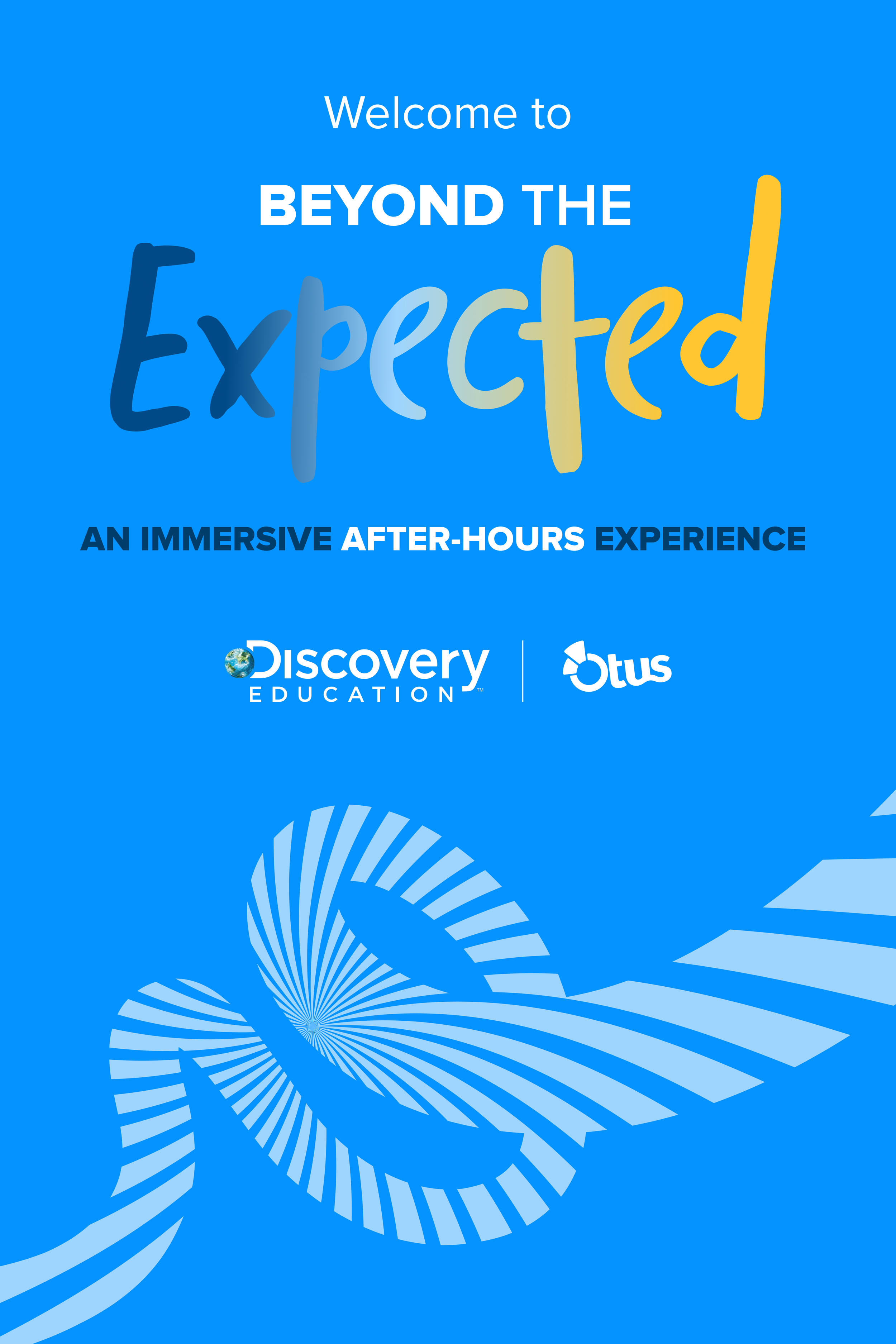
A playful take inspired by the Museum of Illusions.
For the second experience, the creative direction leaned into the unexpected. Drawing inspiration from the visual illusions and immersive feel of the Museum of Illusions, the design used bold, dimensional typography, vibrant blue, and optical-inspired graphics to create a more energetic and experiential expression of the brand.
the impact
What began as a creative direction for Discovery Education's conference presence grew into something much bigger. The Powering Progress identity resonated across the organization and ultimately became the foundation of the company's new visual identity.
As the identity expanded to major industry events like ISTE, the conference experience generated 1,400 booth interactions and more than $150K in ACV pipeline. These results demonstrated the impact of bringing a cohesive, recognizable visual identity to life across key audience touchpoints.
Being part of this evolution gave me the opportunity to contribute to a brand system that extended far beyond individual campaigns and events, becoming a lasting part of how Discovery Education presented itself to the world.