Vitali studio
Brand Identity & Logo Design
Vitali Studio is a Pilates studio based in Ciudad Juárez, Mexico. The goal was to create a visual identity that captures the balance between movement, wellness, and personality.
Inspired by the Teaser Pilates pose, the custom logo brings movement into the heart of the brand. A muted green and beige palette, paired with sophisticated typography and playful graphic elements, creates an identity that feels calm, modern, and approachable.
The identity has since grown beyond the original logo, appearing across a wide range of branded merchandise, studio materials, and social media. What began as a visual identity has become an established part of the studio's presence and customer experience.
Role: Logo Design, Brand Identity Development, Art Direction
Channels: Print, Merchandise, Social Media, Studio Branding
Tools: Adobe Illustrator, Procreate
The process began with the client's vision of creating a brand that evoked a sense of zen, calm, and overall well-being. They shared visual references and inspiration to help communicate the aesthetic and direction they envisioned.
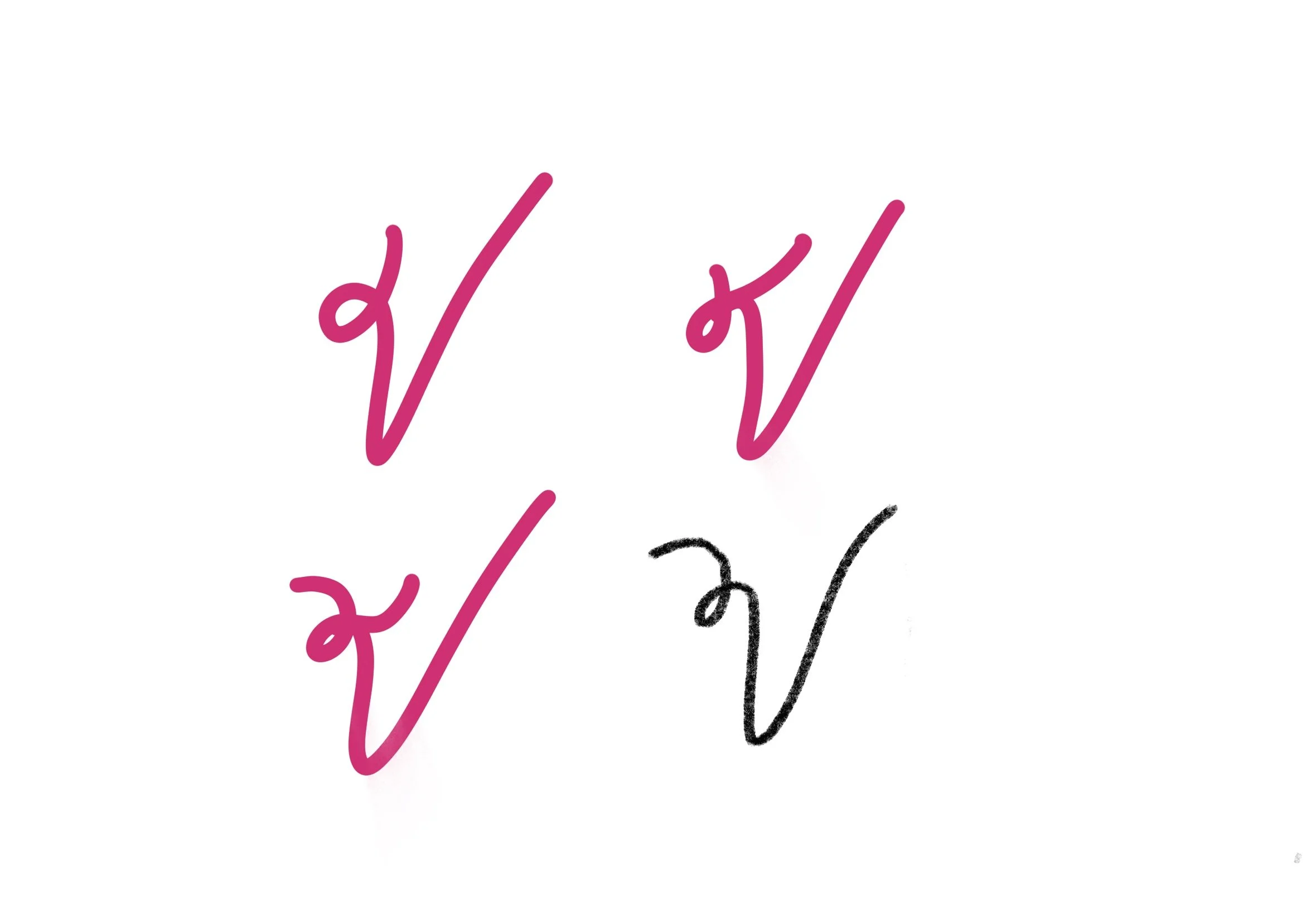
Using these as a starting point, I explored different visual approaches through moodboards, hand-drawn sketches, and logo variations, balancing the serenity of Pilates with movement and personality to create a distinctive identity.
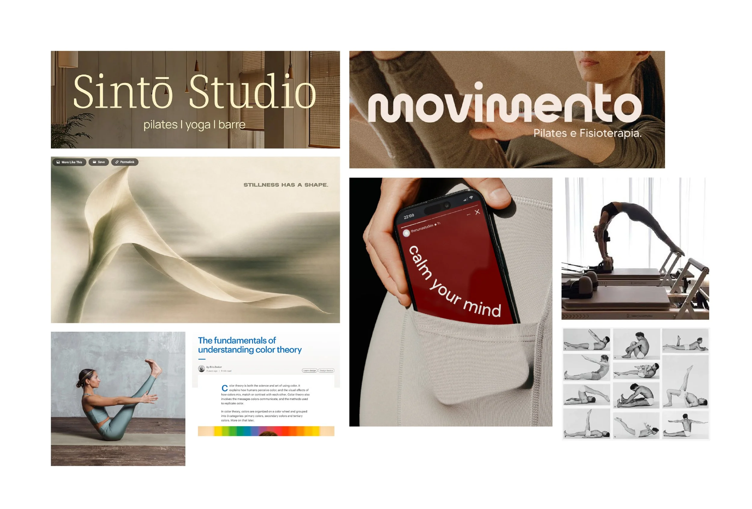
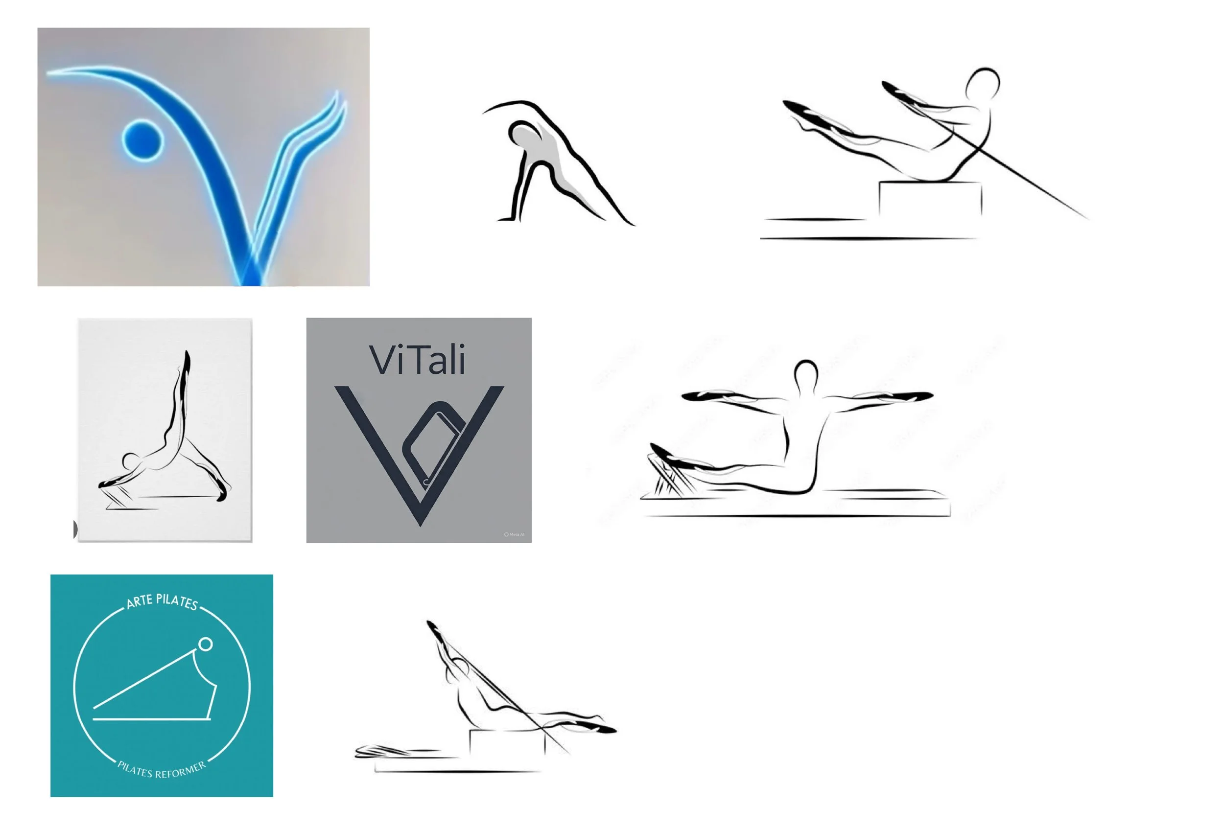
Client Imagery
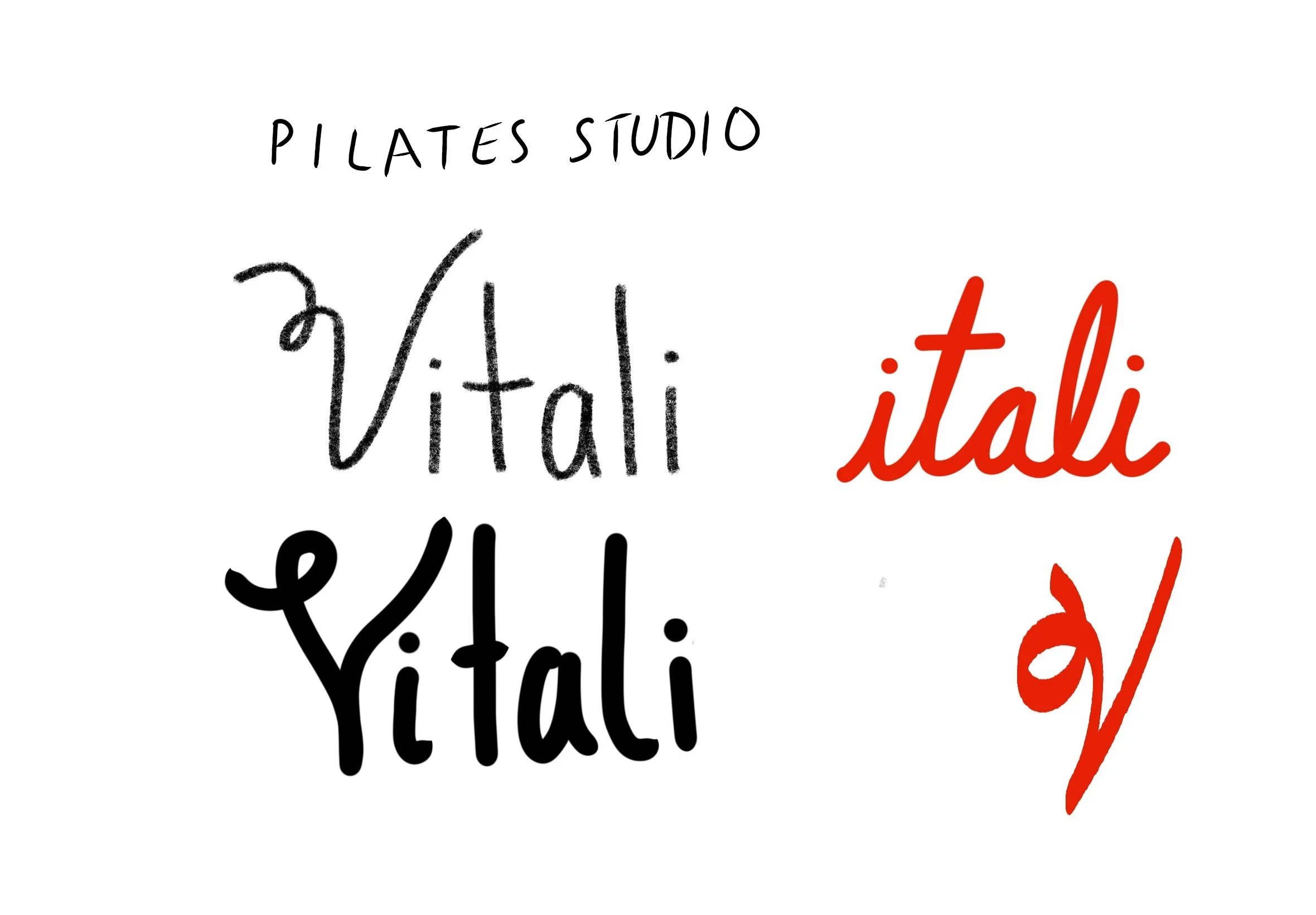
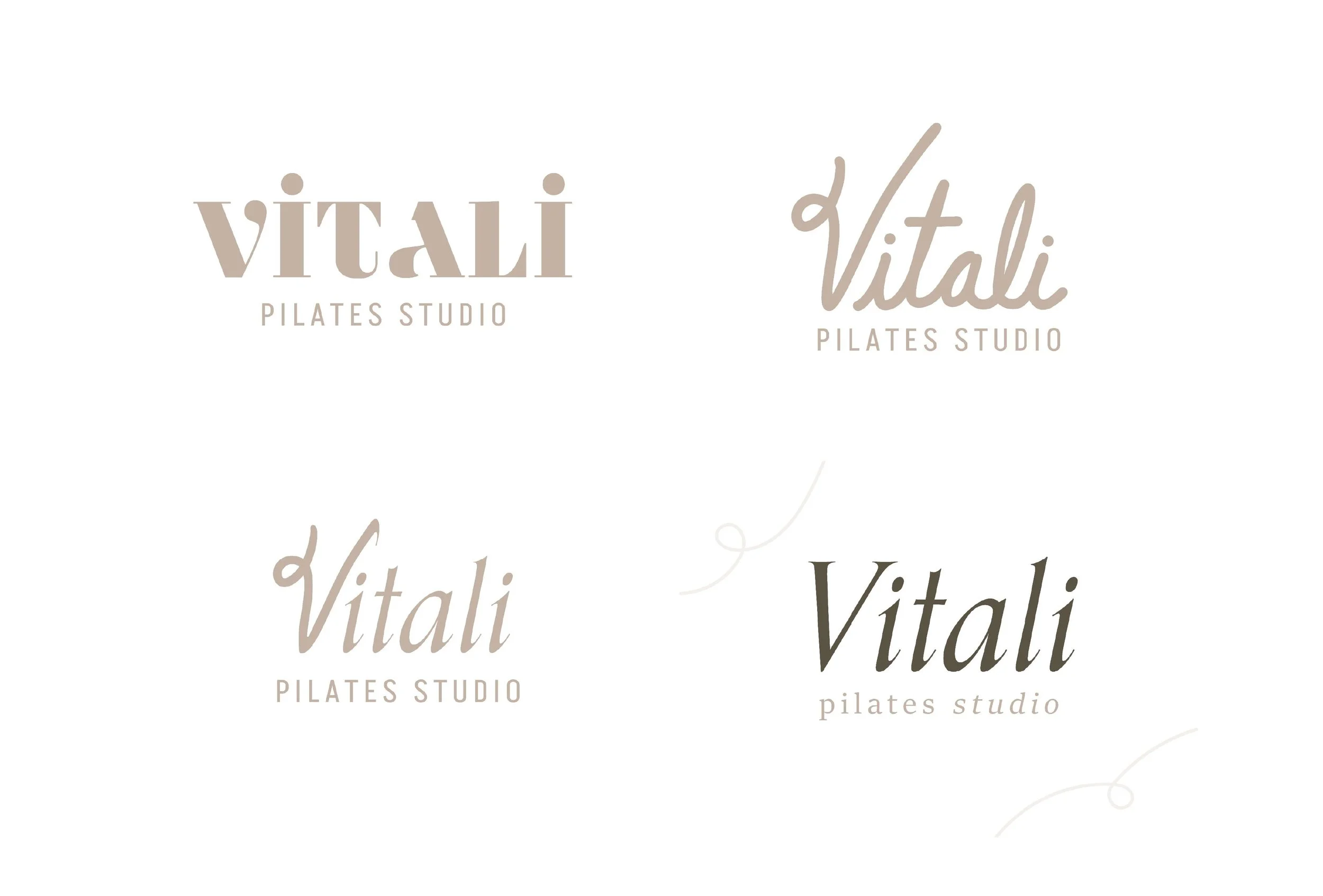
I knew I wanted typography to play a central role in the identity, using a wordmark as the foundation rather than relying solely on a graphic symbol. After exploring Adobe Fonts, I landed on Mundial, a modern typeface that offered the right starting point.
I began by customizing the "V" in Vitali, then refined the remaining characters to create a more personalized wordmark with a distinctive look and feel. This approach gave the logo its own character while maintaining a clean, contemporary aesthetic.
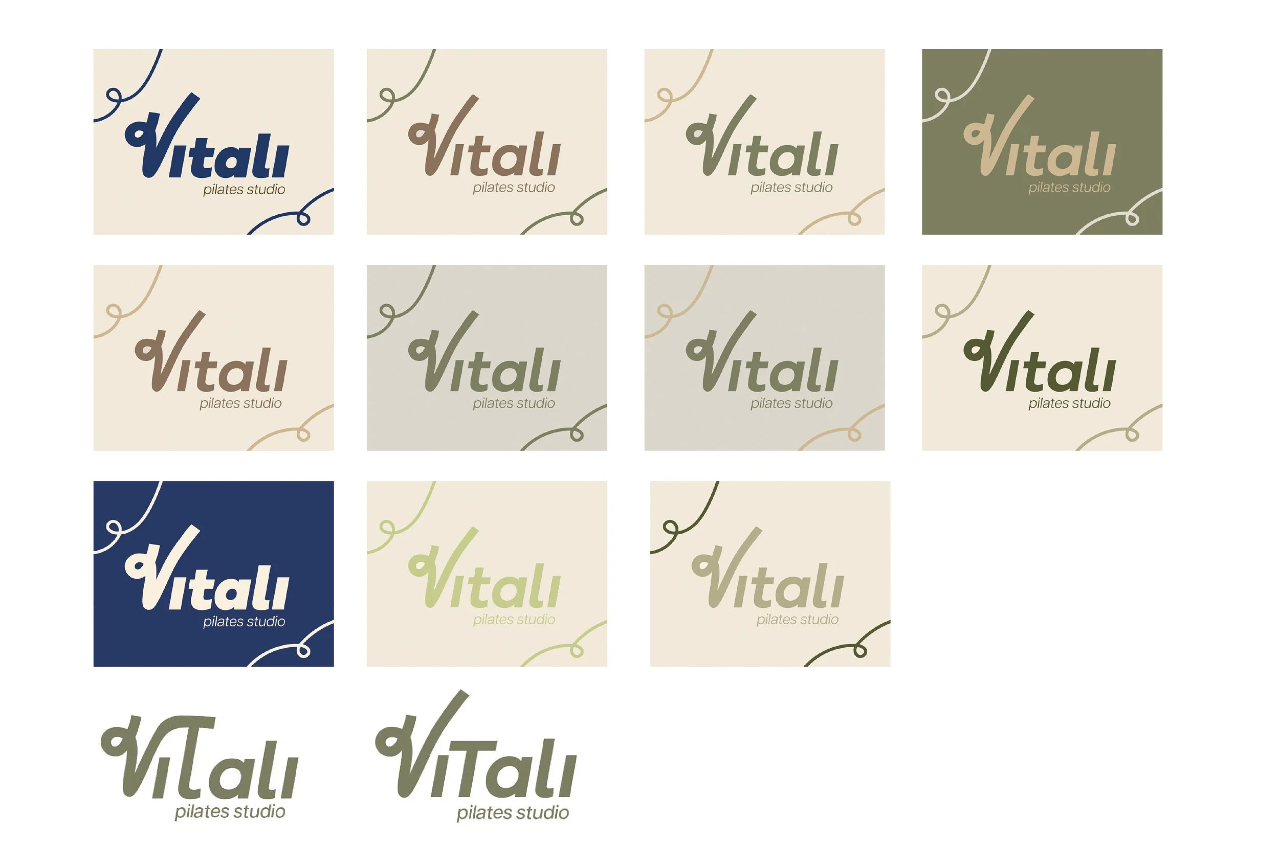
With the initial lettering established, I explored variations in weight, color, and composition to find the right balance for the identity.
The last two variations shown were developed in response to the client's request to place greater emphasis on the letters V and T, representing their initials. I explored this direction so we could visualize the idea and evaluate how it translated into the wordmark. However, I felt that emphasizing both letters made the logo less cohesive and overly literal. I wanted the identity to feel intentional and recognizable without relying on such explicit references, ultimately recommending a more refined approach that prioritized the overall wordmark.
Inspired by Joseph Pilates' Teaser pose, the logo captures the balance, strength, and fluidity of the practice. I translated the pose into a distinctive typographic mark, incorporating the movement of the body into the letterform to create a symbol that feels both personal and connected to the essence of Pilates.
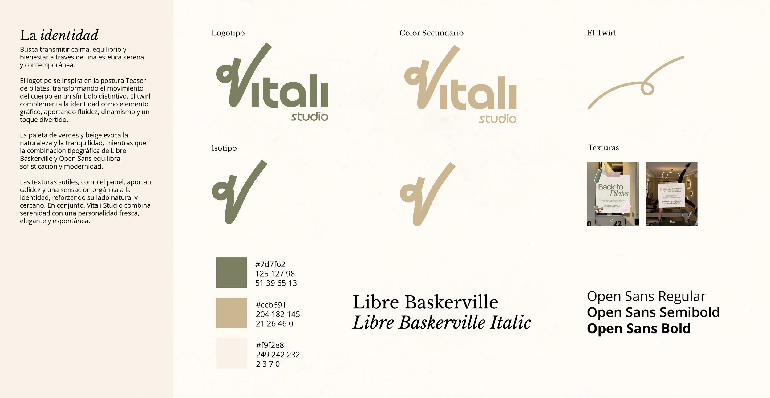
To help maintain a consistent brand presence, I developed a visual style tile and provided art direction for how the identity should translate across social media. This included guidance on typography, color, graphic elements, and the use of custom assets such as the twirl, illustrations, and textured backgrounds.
Real-world applications below.
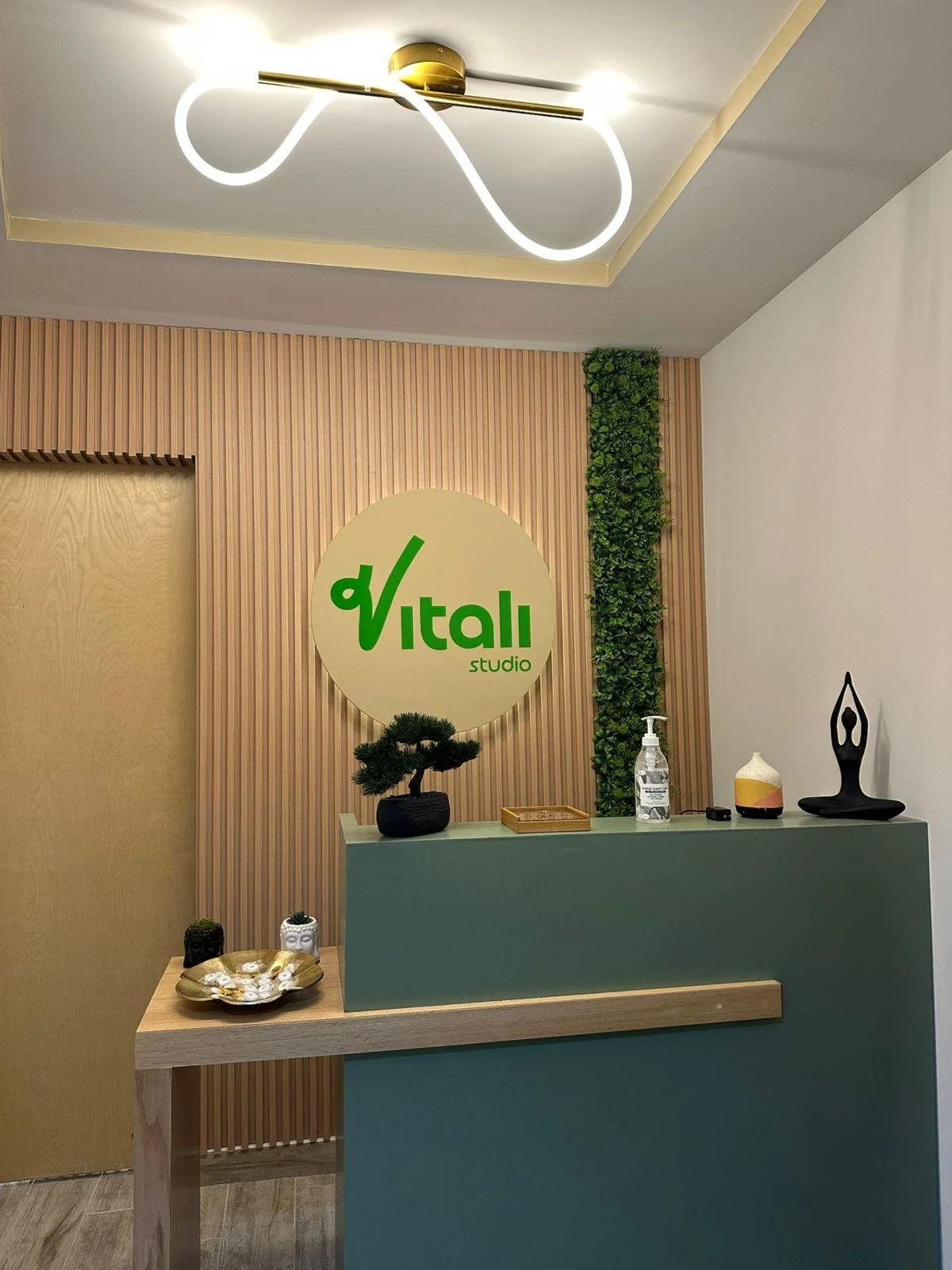
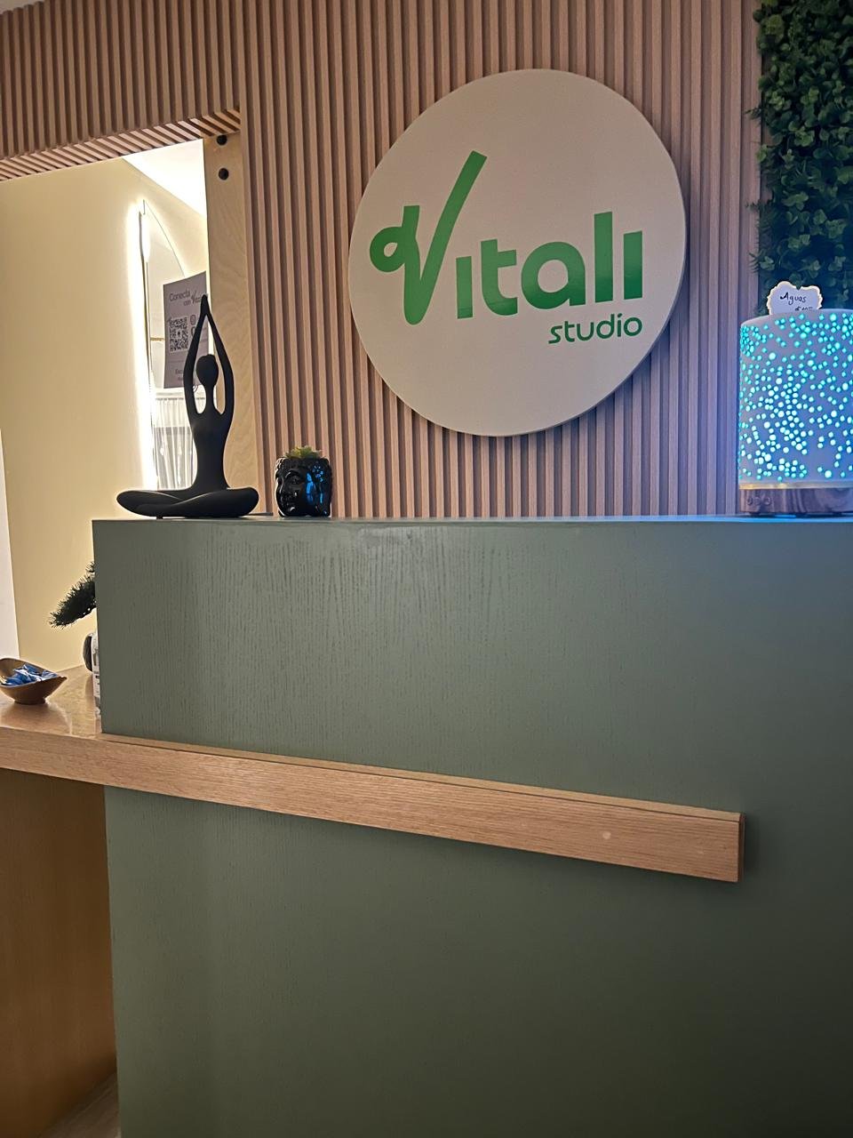
Studio Entrance
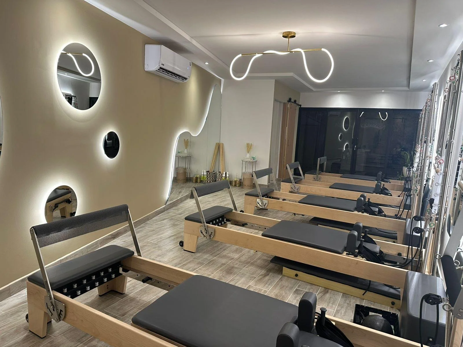
Studio
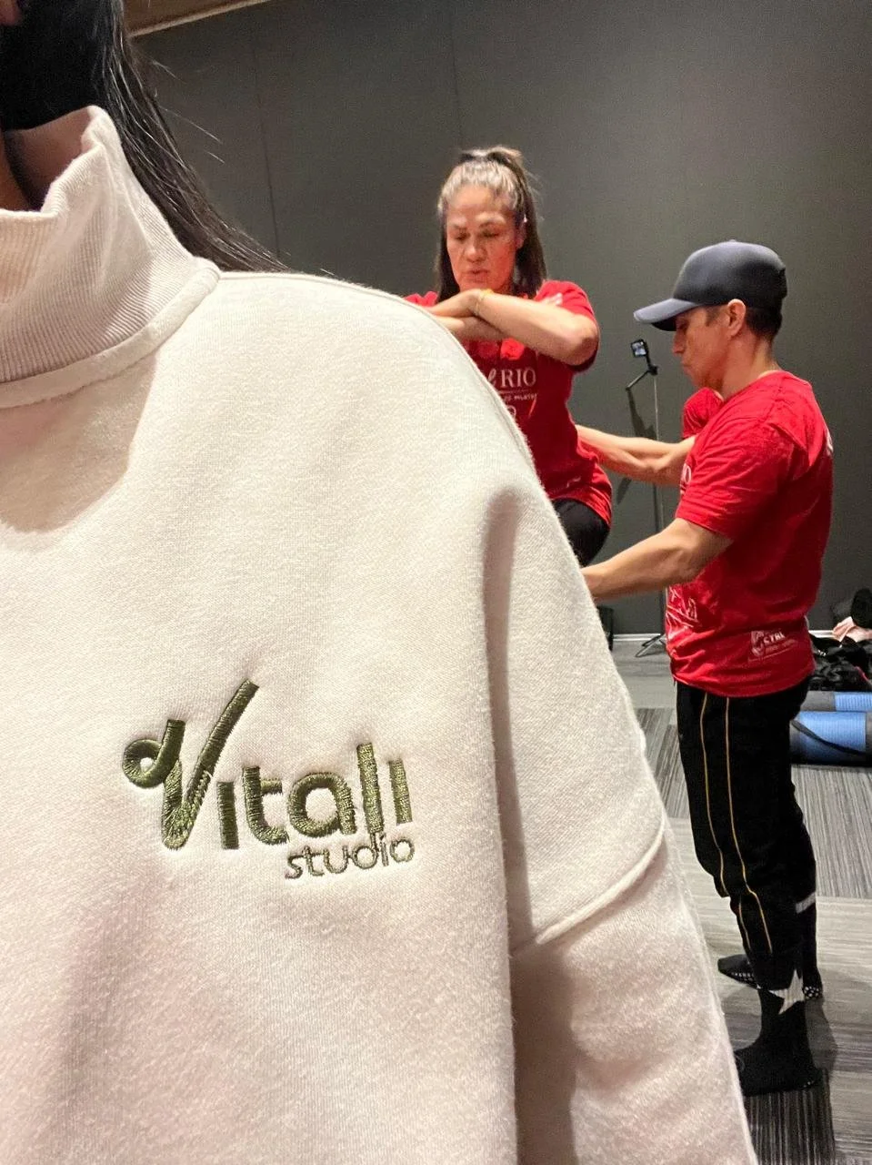
Embroidered Pull-Over Sweater
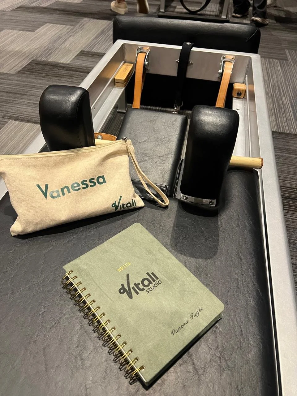
Bag and Notebook
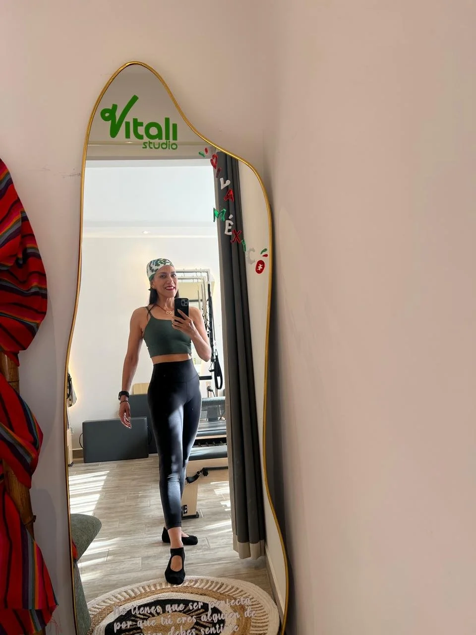
Vinyl Logo on Mirror
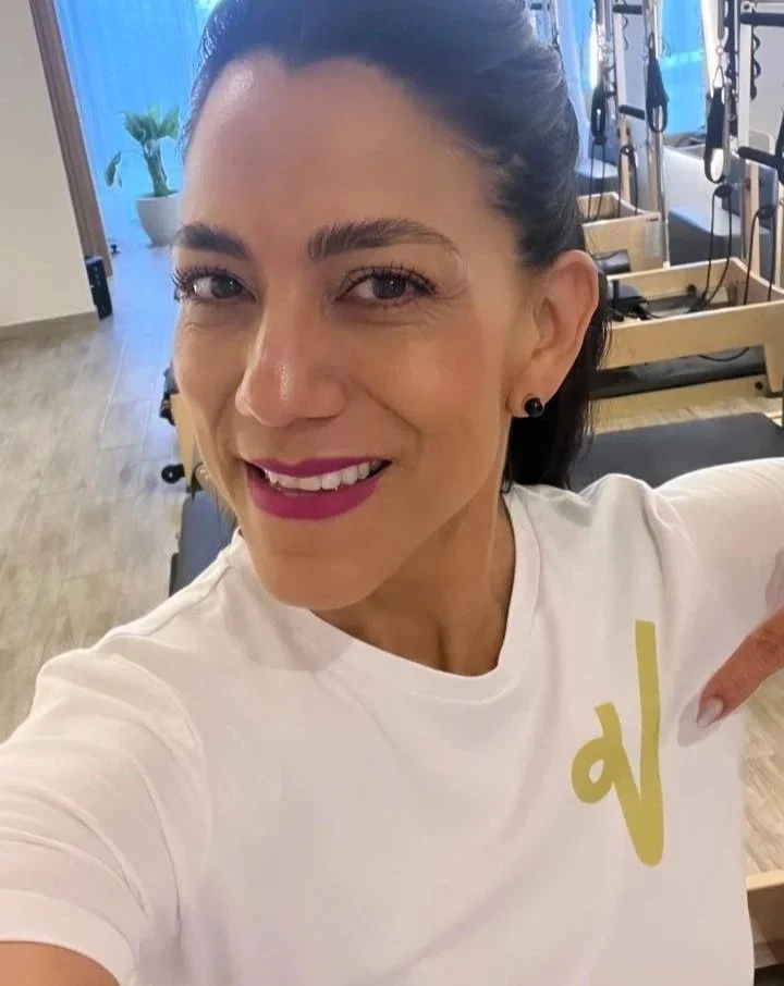
T-Shirt
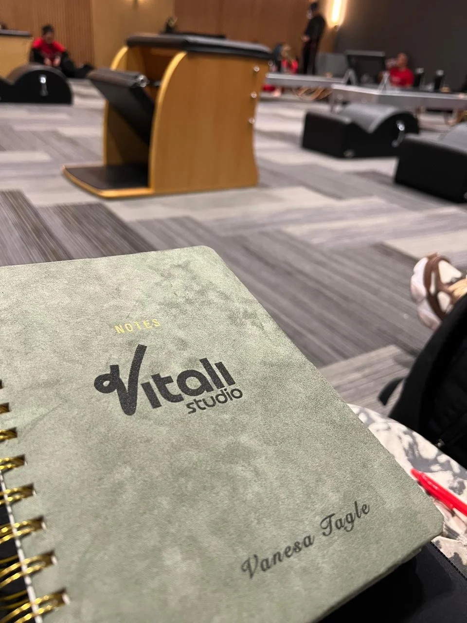
Notebook
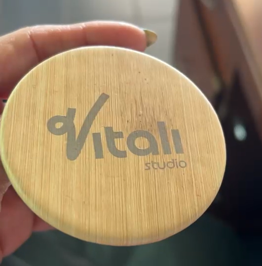
Compact Mirror
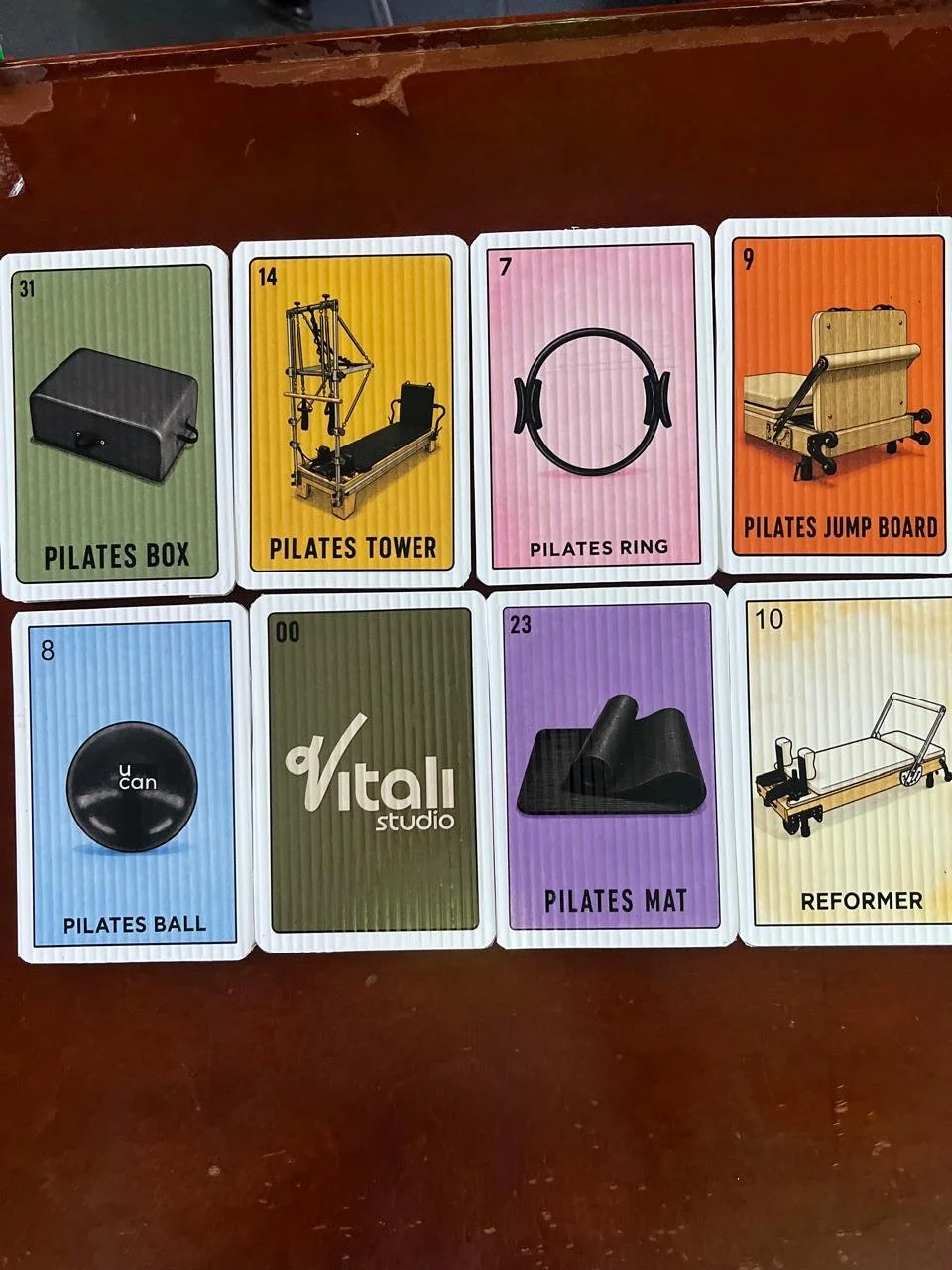
Vitali Pilates Loteria
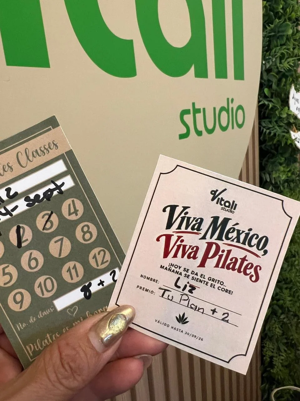
Frequent Customer Cards
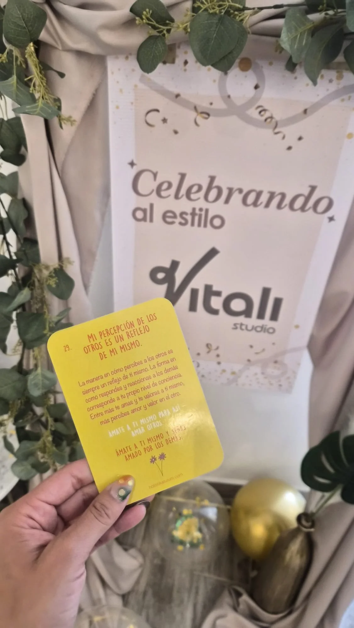
Celebration Banner
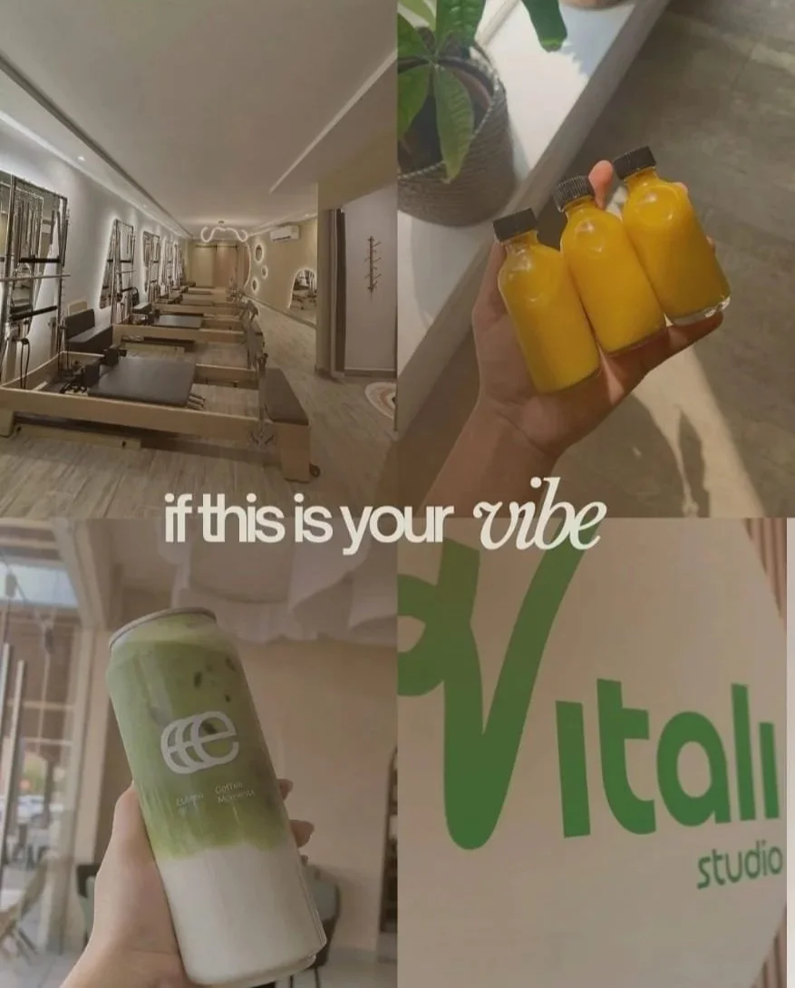
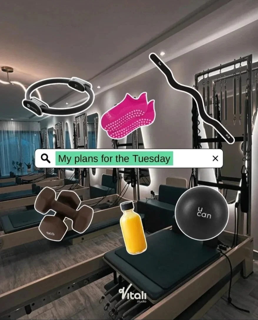
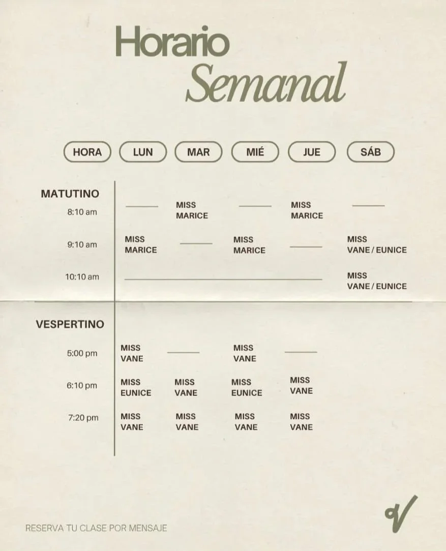
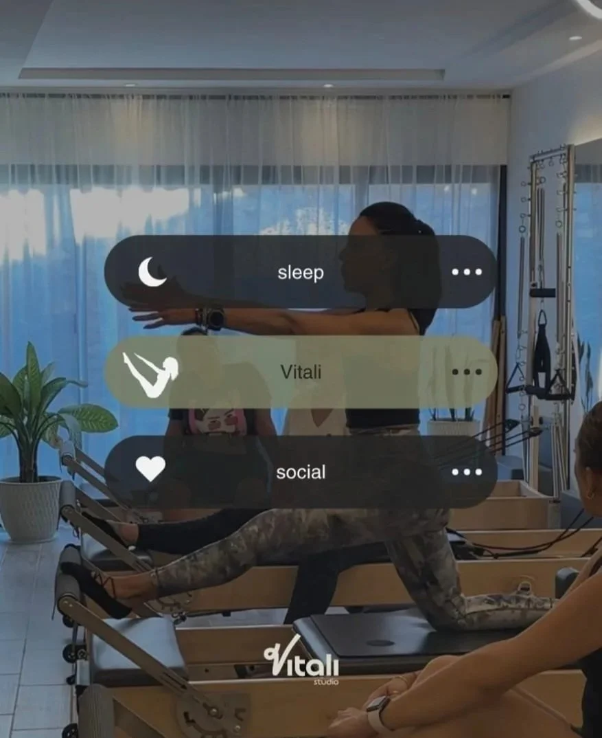
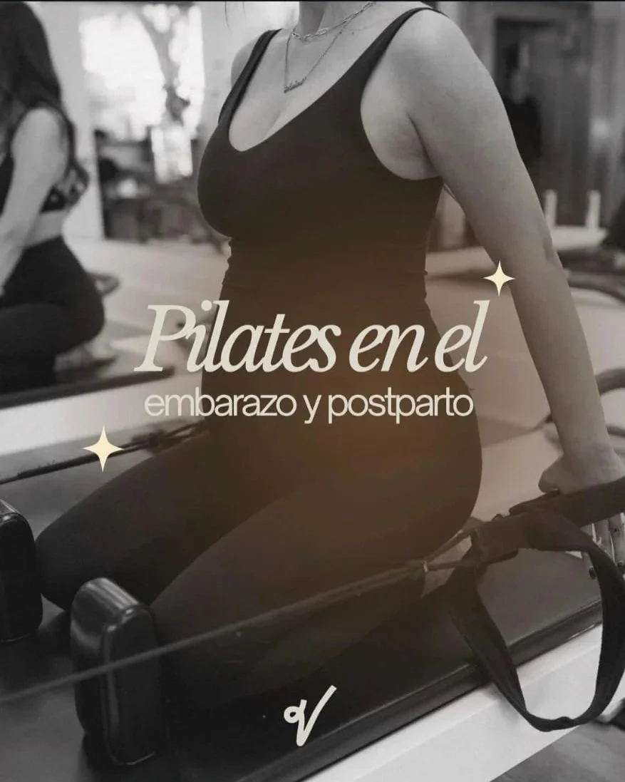
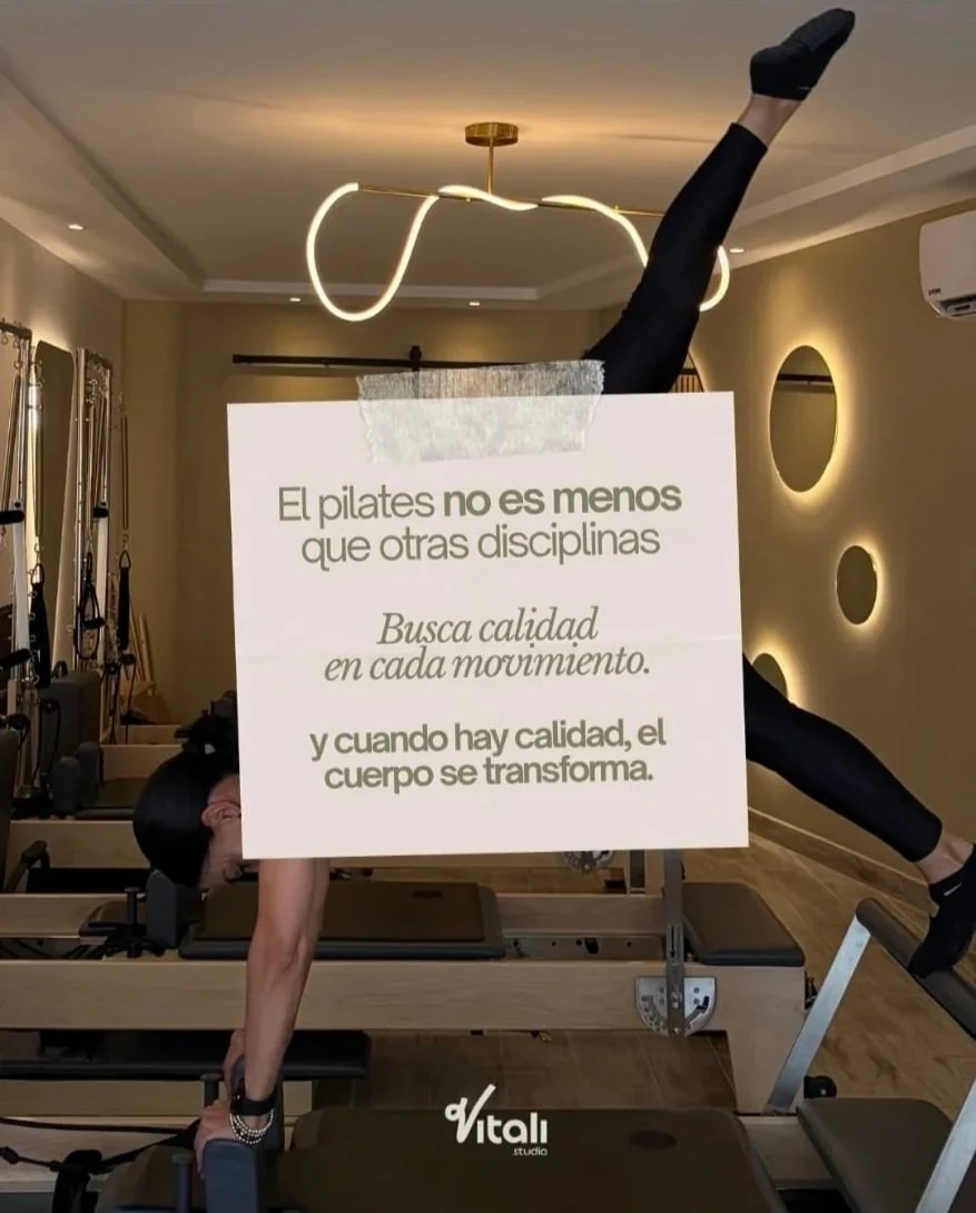
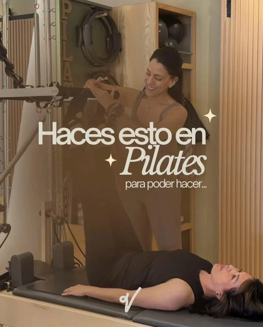
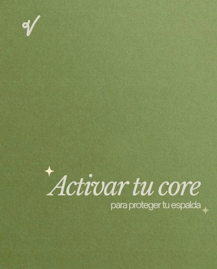
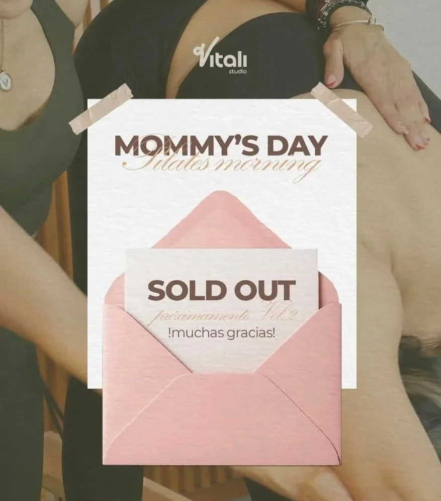
Social Media Applications
The visual identity continued into the studio’s social media presence through the creative direction and visual assets established for the brand. The examples shown here were created by Nova Creative Studio, bringing the identity to life through its typography, color palette, illustrations, and graphic elements.